8,000 people had a company homepage. They bookmarked their way around it.
Freedom Mortgage's intranet was the official front door to everything, and quietly the thing employees had learned to avoid. I redesigned it end to end as the sole designer. ServiceNow named it one of the best employee portals of 2025.
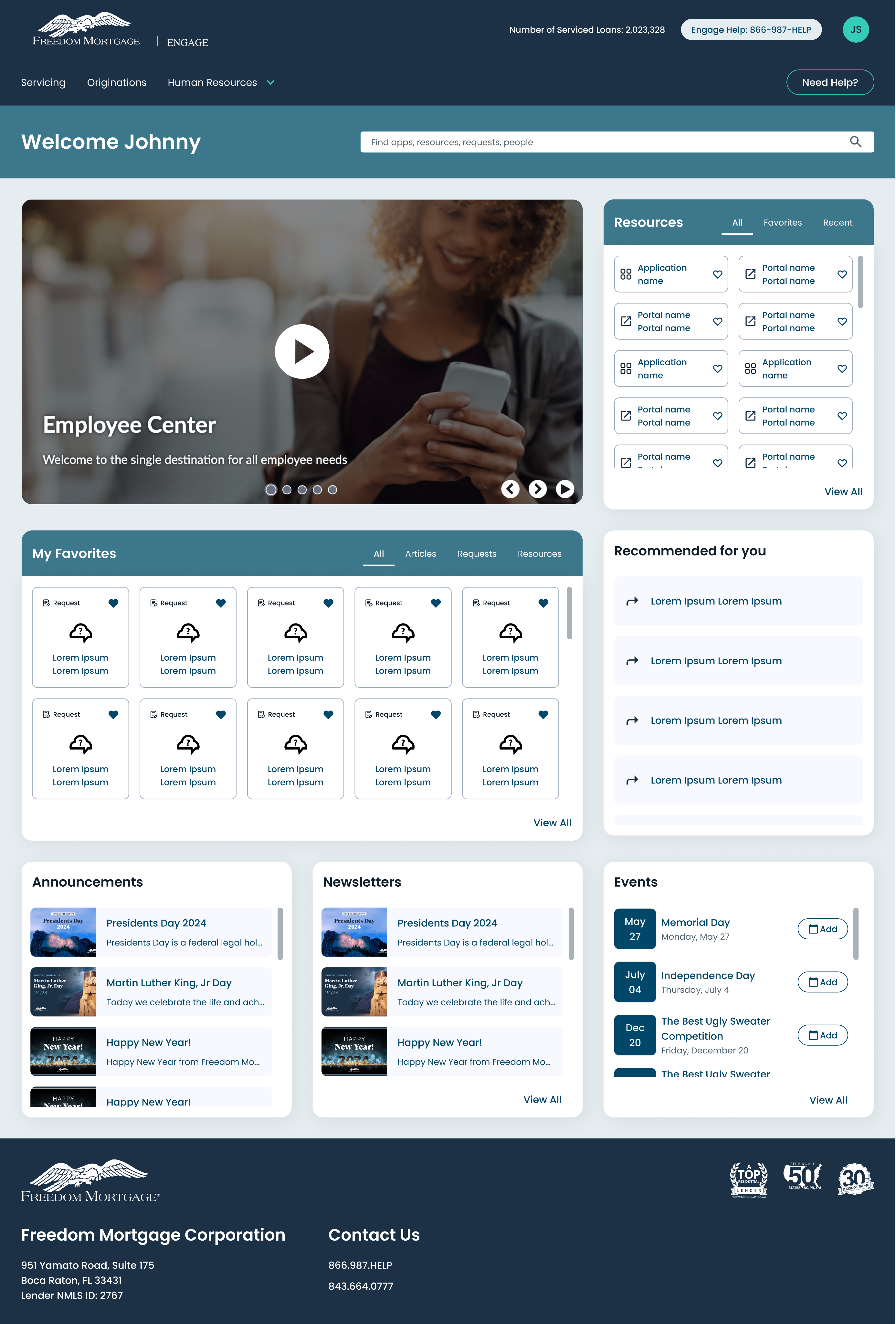
01The problem
A mortgage servicer runs on internal systems. Loan servicing, originations, HR, IT requests, compliance updates: 8,000 people needed all of it every day, and Engage was where they were supposed to find it.
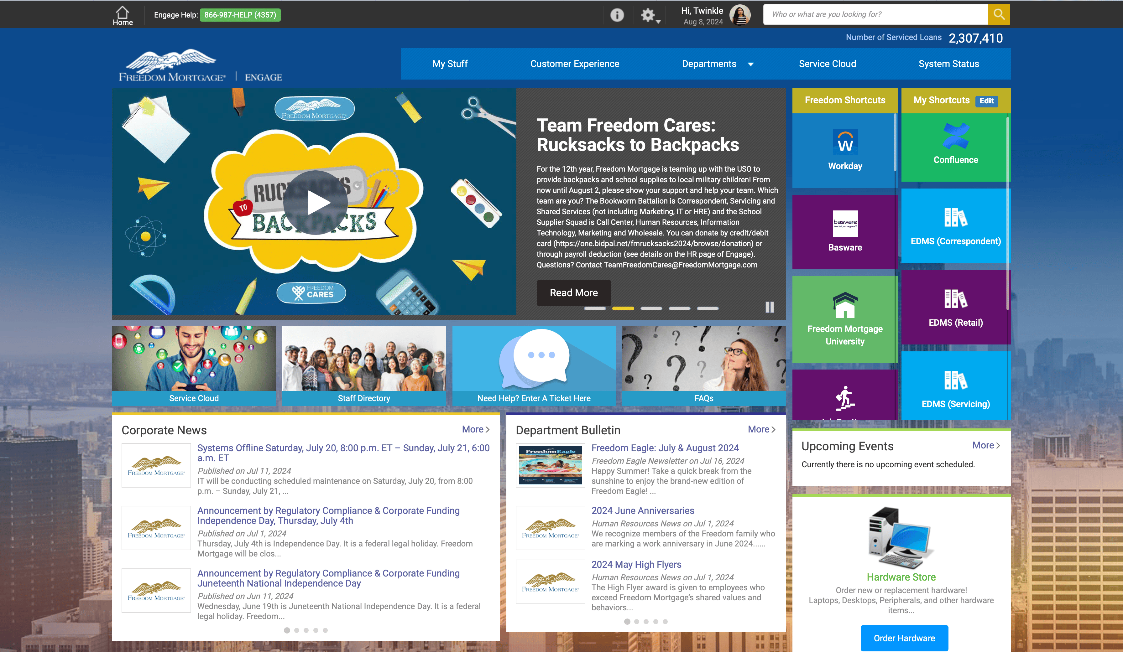
They routed around it instead. The homepage was dense with competing tiles and no hierarchy. Search returned incomplete results, ranked badly enough that people stopped trusting it. Nothing adapted to whoever was logged in, so a servicing specialist and an HR coordinator faced the same undifferentiated wall. Content went stale because nobody owned it.
The clearest signal came from an interview.
“It's so cluttered, I just bookmark my stuff and avoid the homepage.”
When people build private workarounds to avoid your product, the product has already lost.
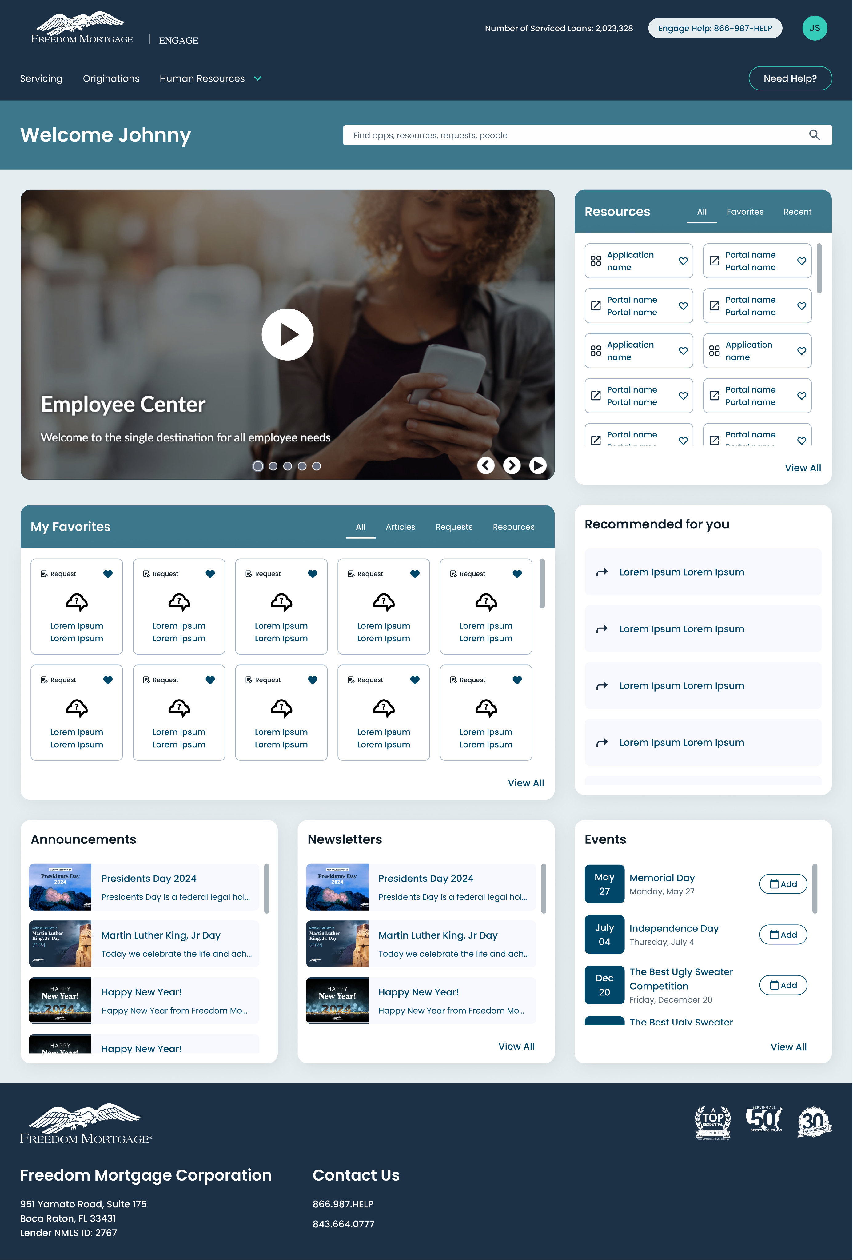
02Before and after
03Research
Seventeen interviews, six months of analytics, and eight task-based usability sessions, run across every department so the findings could not be written off as one team's complaint.
What it showed.
Navigation. Basic tools sat several clicks deep, with no logic to the path.
Search. Poor relevance ranking and incomplete indexing trained people not to use it.
Personalization. One layout served every role, which meant it served none of them.
Workstation reality. People sit in this portal all day at a desk, and the layout wasted the screen they actually had.
Content ownership. No accountability meant no freshness.
04The reframe
It was never a publishing problem.
Engage had been built as a place to put things. Announcements, links, resources, news: the assumption was that people came to read the homepage. The analytics said otherwise. Nobody was visiting Engage. They were passing through it on the way to the five or six tools they used constantly, and every bookmark was evidence of how badly the page served that trip.
So I stopped designing a destination and designed a launchpad. Everything else followed. Search moved to the center. The homepage became something each person could shape around their own tools. The editorial content that used to dominate the page moved into modules that support the trip instead of blocking it.
05What made it hard
It was built inside ServiceNow.
Not greenfield. Every decision had to survive the platform's component model and its limits. A computer science background meant I could establish what was actually buildable before designing it, rather than handing engineering something elegant and impossible.
One page, 8,000 jobs.
Servicing, originations, HR, IT, and corporate functions share almost nothing in their daily tools. Personalization was not a nice-to-have; it was the only way one page could work for all of them.
The old portal decayed for structural reasons.
Without content ownership, any redesign would rot the same way. Governance had to be designed alongside the interface.
06Design decisions

Made search the front door.
Centered and unified across apps, resources, requests, and people, with relevance ranking worth trusting. In a dense information environment, search is the shortest path between a person and their job.
Search results unified across announcements, applications, articles, news, people, and requests.
Let people build their own homepage.
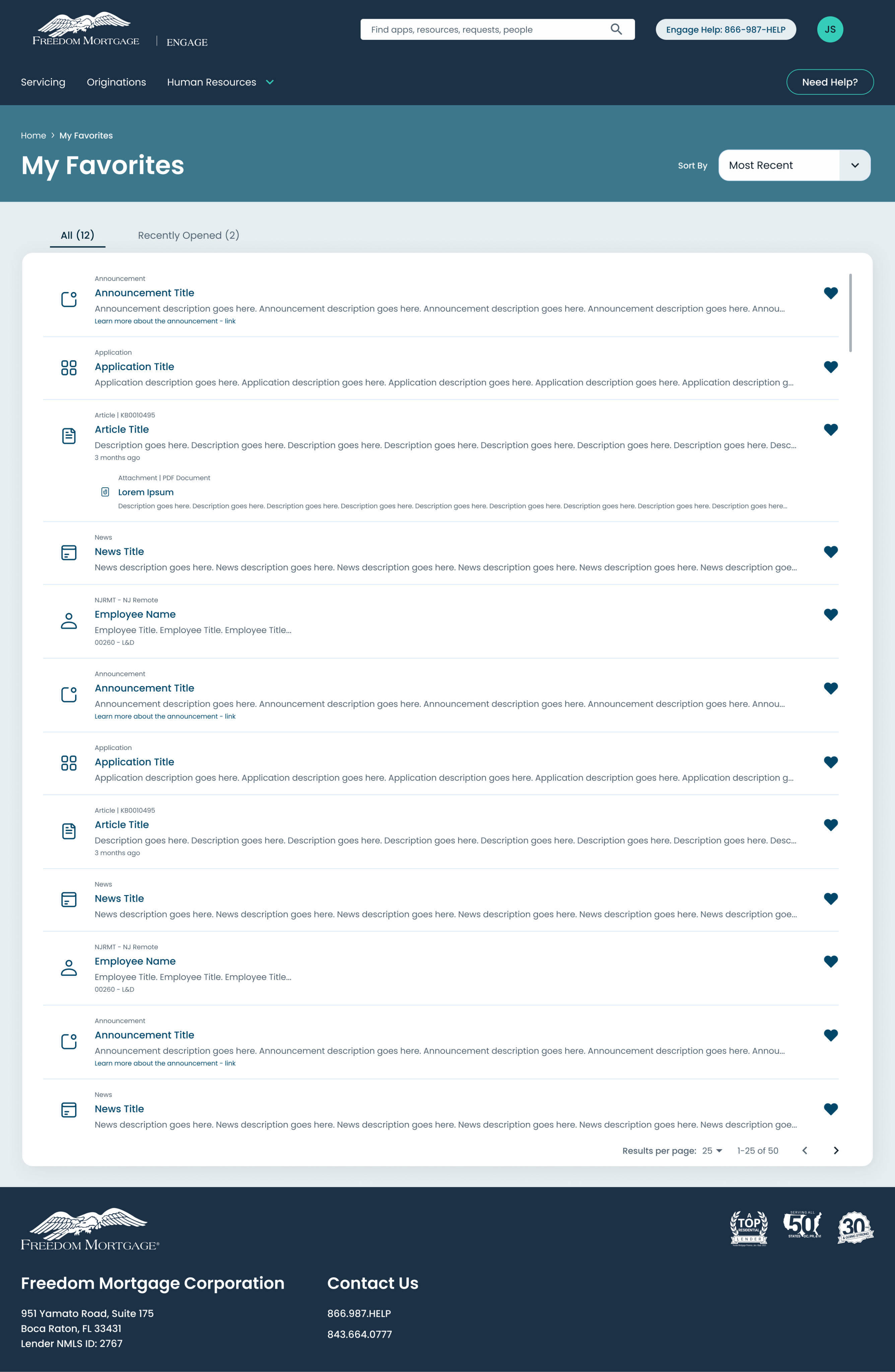
Favorites and My Resources let employees pin what they actually use, so the portal adapts to the role instead of averaging across 8,000 of them.
The My Favorites page: everything an employee has pinned, in one place.
Designed the empty states.
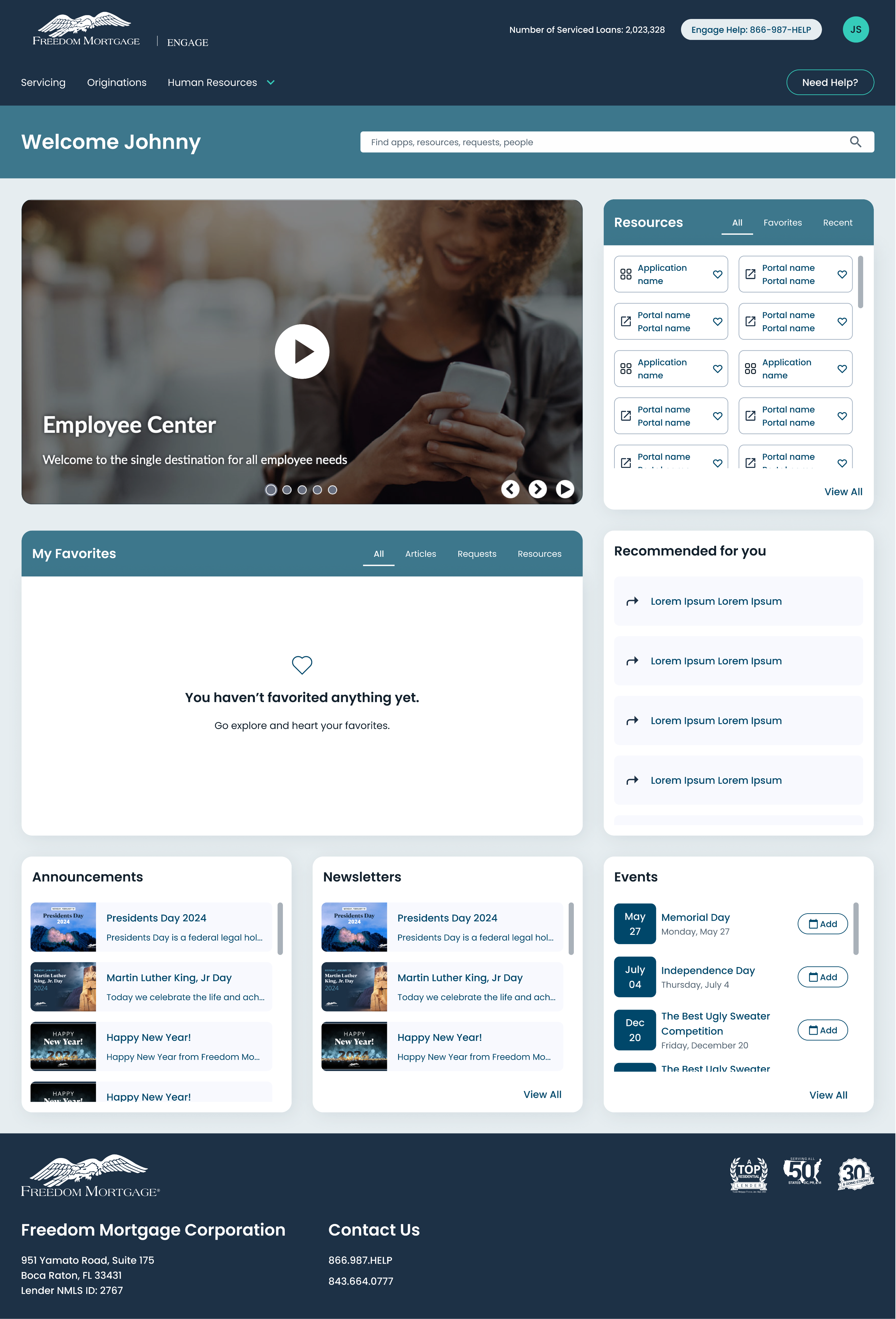
A new hire with nothing pinned sees a clear invitation to start, not a blank panel. Empty is the first state most people see and the one most portals skip.
What a new hire sees before anything is pinned: an invitation to start, not a blank panel.
Centralized company communication.
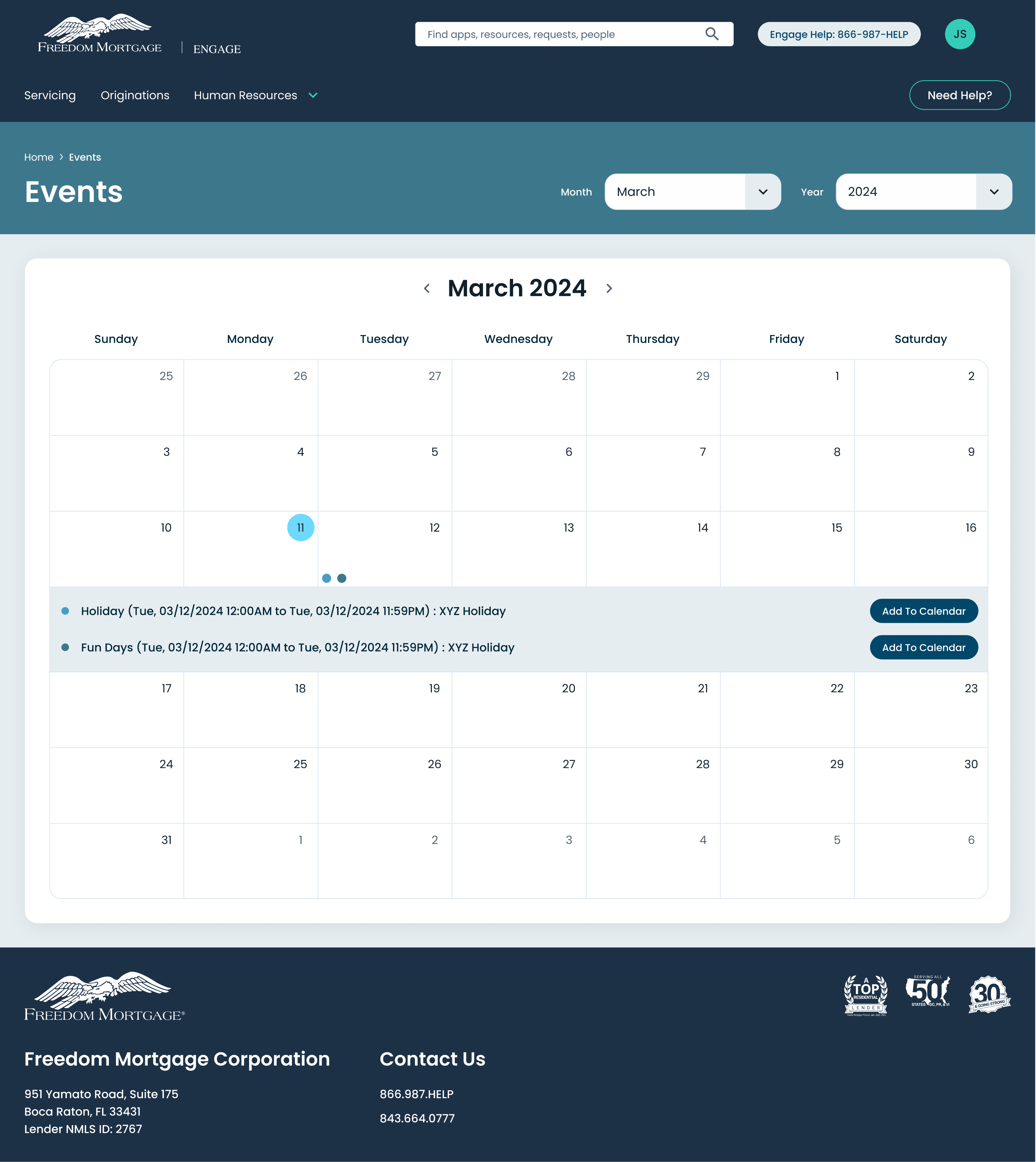
Announcements, newsletters, and an events calendar with one-click add-to-calendar, replacing scattered all-staff email.
The events calendar, with one-click add-to-calendar for every event.
Made adding an event one click.
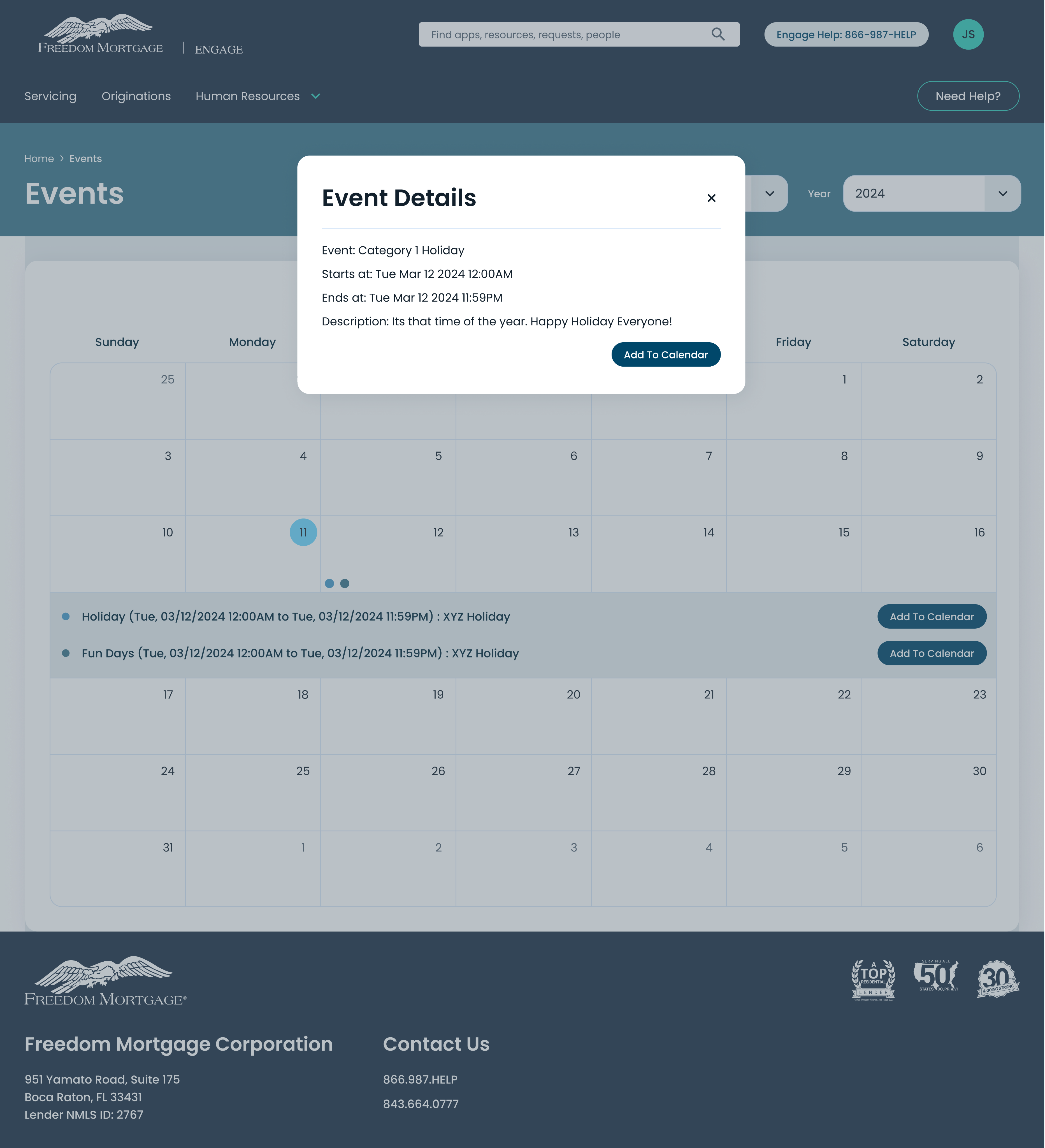
A calendar is only useful if the event ends up in the calendar people actually check. The detail view ends in a single action rather than a copied date.
Event details, one click from the calendar to the employee's own.
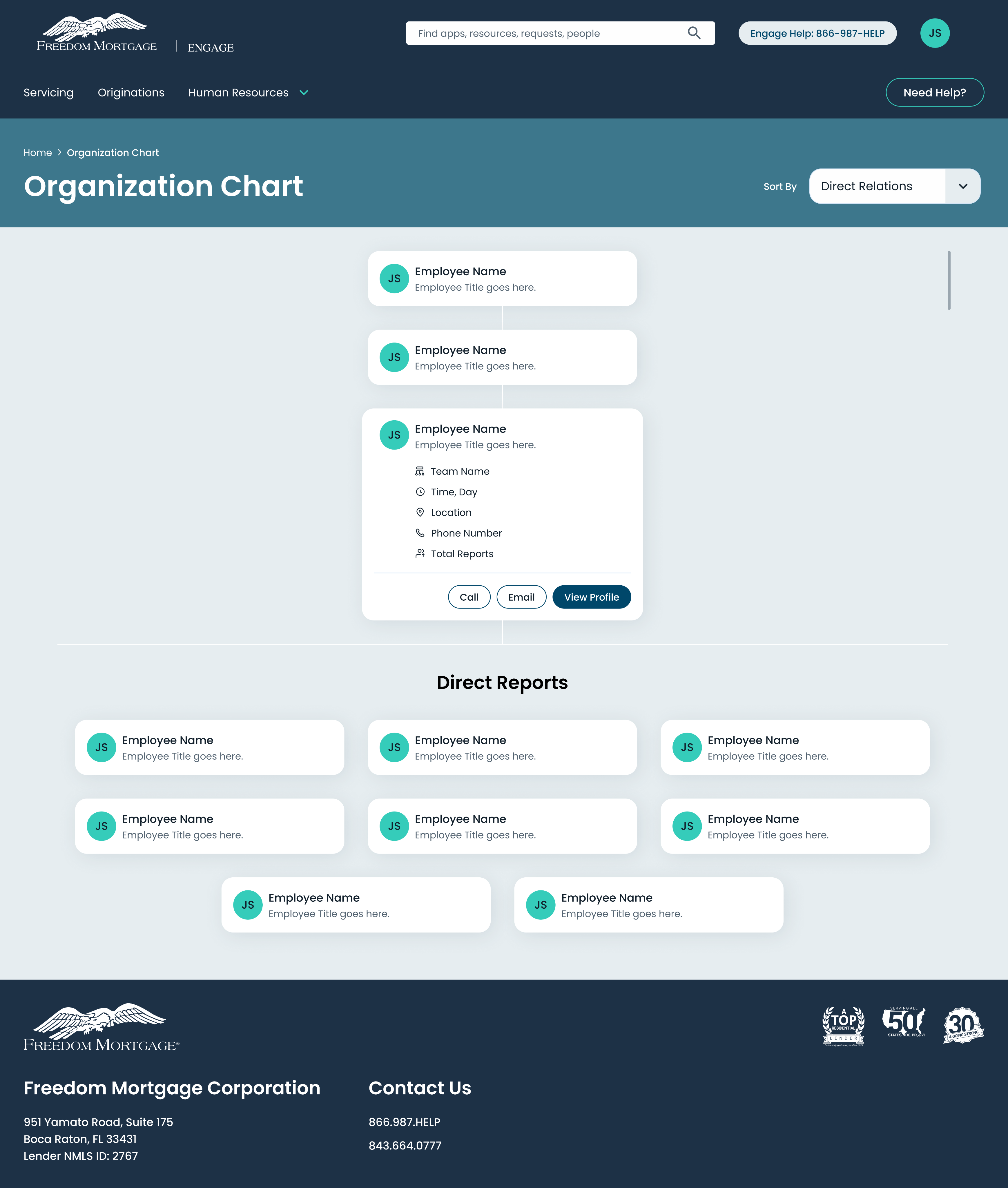
Made the org chart a working directory.
Reporting lines are only half of what people need. Call, email, and profile actions sit on the same card, so finding someone and reaching them is one step instead of two systems.
The organization chart: reporting lines and contact actions in one view.
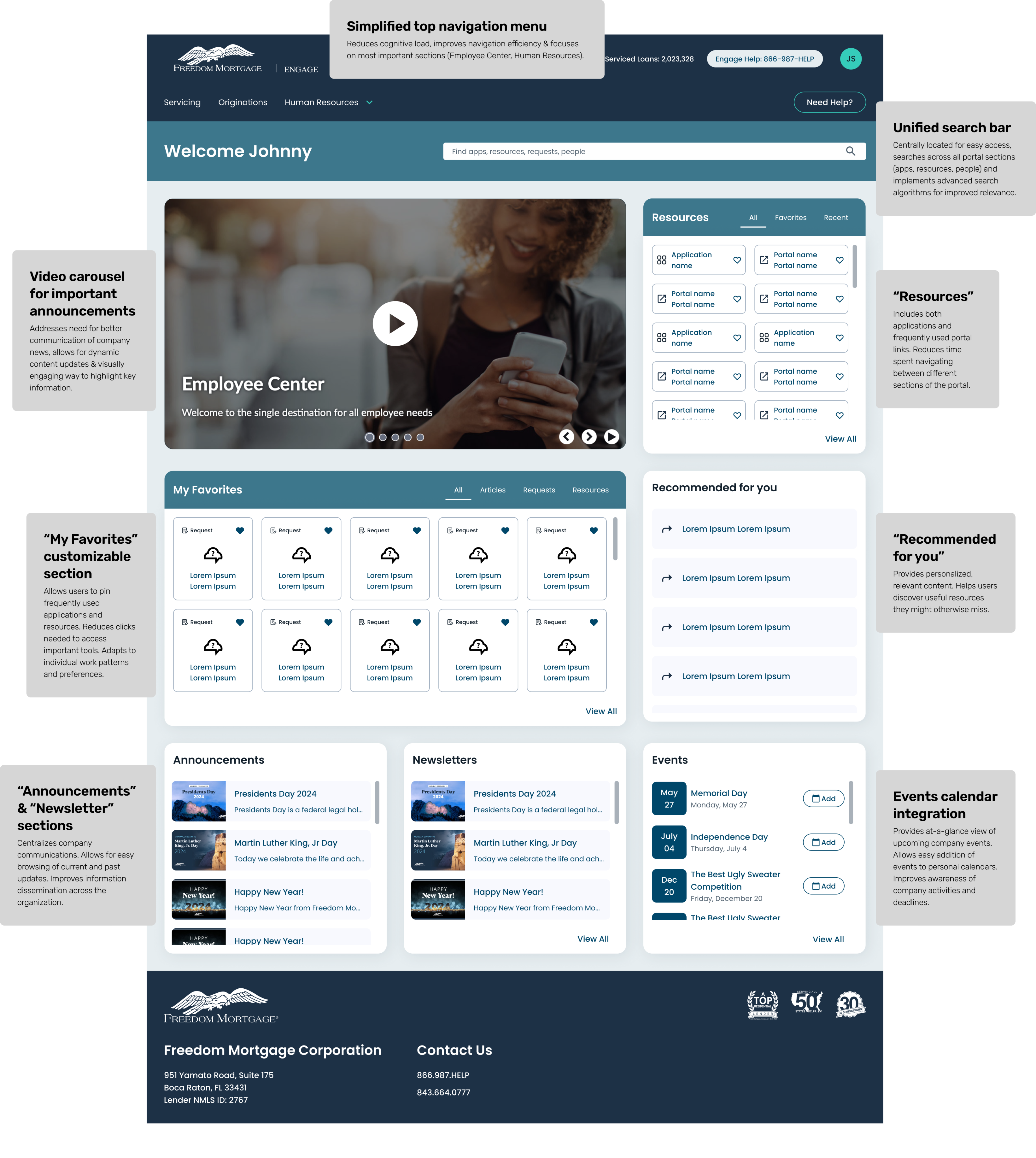
Cut navigation to what the data justified.
The top menu was reduced to the sections people actually used, lowering the cost of the first decision on the page.
Grouped resources by intent, not by system owner.
Applications and portal links sit together, so nobody has to know which internal team owns which tool.
07External recognition
ServiceNow recognized Engage in its 2025 Best Employee Portal contest. The judges cited adoption and the governance model behind it, not only the interface.
“Freedom Mortgage has established clear and effective communication, governance, and roadmap strategies to facilitate very impressive adoption improvements for a portal that is less than six months old. Increasing from 457,768 views over a 9-month period to over 1.05 million views in just 4.5 months shows a dramatic increase in user engagement and impressed our judges.”
08What changed
09What I took from it
Watch the workarounds. The bookmarks were the finding. People tell you what is broken by what they build to avoid it.
Search is not a feature, it is the front door. In a dense information environment it was the single largest lever on productivity.
Governance is part of the design. Content ownership determined whether the portal would still be good a year later. The interface alone could not carry that.
Internal tools deserve the same rigor as customer-facing ones. The same standards produced the same kind of gains, and the business case was easier to prove.
I did not redesign a homepage. I changed how 8,000 people get to work.