I was the design organization.
KickPost is a B2B platform where vendors, resellers, and sales reps operate as one commercial team. Over six months I was its only product designer: the strategy, the architecture, the design system, and every screen in the product. No design director, no team, no precedent. A CEO with a vision, two interns I was teaching, and everything else was mine.
01The problem
Most B2B revenue no longer moves in a straight line from vendor to customer. Forrester puts roughly 70% of B2B purchases through an indirect route, and around 75% of world trade through indirect channels. The people who actually close those deals often work for a different company than the one whose product they are selling.
That creates a coordination problem no single company's software is built to solve. A vendor launches an incentive. It reaches resellers by email, a PDF, or a portal login nobody remembers. The reseller's reps may never hear about it. If they do sell, working out who earned what means reconciling spreadsheets across company boundaries. Training lives somewhere else again. Everyone is trying to do the same thing, using tools designed for one organization at a time.
The category built to fix this mostly did not. The consistent finding across partner-management literature is that PRM implementations fail on adoption: partners disengage when they have to navigate several systems just to reach training, content, deals, or programs, and portals go unused.
“It's different in every way from the normal chaos caused by traditional PRM, partner portals and endless systems.”
The problem was never to build a better partner portal. It was to build one product where a vendor, a manager, and a rep each get something coherent, and where the reason to open it is obvious enough that partners actually do.
02Research and strategy
There was no design function to inherit, no research team to brief, and no existing strategy. I built the picture from the category itself, then from the three people who would have to use the product, then turned both into a sequence of decisions.
Market discovery
Adoption is the failure mode, not features.
The recurring explanation for PRM programs failing is that partners simply do not use the portal. Any design requiring a partner to learn a system before getting value would inherit that failure.
Fragmentation is the specific cause.
Partners disengage when training, content, deals, and programs live in separate places. This pointed at a single feed rather than a portal with sections.
Enablement is the neglected half.
Only about a quarter to a third of companies run a formal partner education program, though certified partners substantially outperform untrained ones.
Attention is unevenly distributed.
In most partner programs roughly 20% of partners produce about 80% of channel revenue. The product had to serve the productive minority without locking out the long tail.
The three users
Runs programs, pays for the platform. Creates incentives, posts, trainings, and assets; sets fees, caps, and billing; needs to know whether any of it is working. Succeeds when partners engage and revenue is attributable.
“We launched it, I don't know if anyone saw it.”
Is this budget doing anything?
Sends email blasts, chases partner managers, builds spreadsheets.
Blind. Spending real money into a channel they cannot see.
Sits between vendor and rep. Approves or declines what reaches their team, manages who is on it, decides how payouts split. Succeeds when their team earns without the manager becoming a bottleneck or a bookkeeper.
“I'm not running a payroll department for someone else's incentive.”
Is this good for my team or just more admin?
Forwards things selectively, reconciles splits by hand, fields “where's my money” questions.
Squeezed between a vendor's program and a team's expectations.
Sells for a living, owes the platform nothing. Wants to know what is worth their time, what they will earn, and whether they have been paid. Succeeds when the answer takes seconds.
“Another portal login.”
What's in it for me, and is it worth the time?
Ignores the portal, sells what they know, asks a colleague about payouts.
Skeptical, unwilling to spend attention on a promise they cannot verify.
Pain points
What the users needed, and what the business needed
One place worth opening. The number visible before the click. Money whose status is never ambiguous. A decision that comes back with a reason. Learning that pays.
Adoption is the metric the category fails on, so the product had to earn a partner's attention rather than assume it. Vendors needed attribution to justify spend. The platform needed to hold three audiences without splitting into three products, and to be buildable by a small engineering team inside six months.
These converge on one idea: make the partner's next action obvious and its payoff visible.
Flow architecture
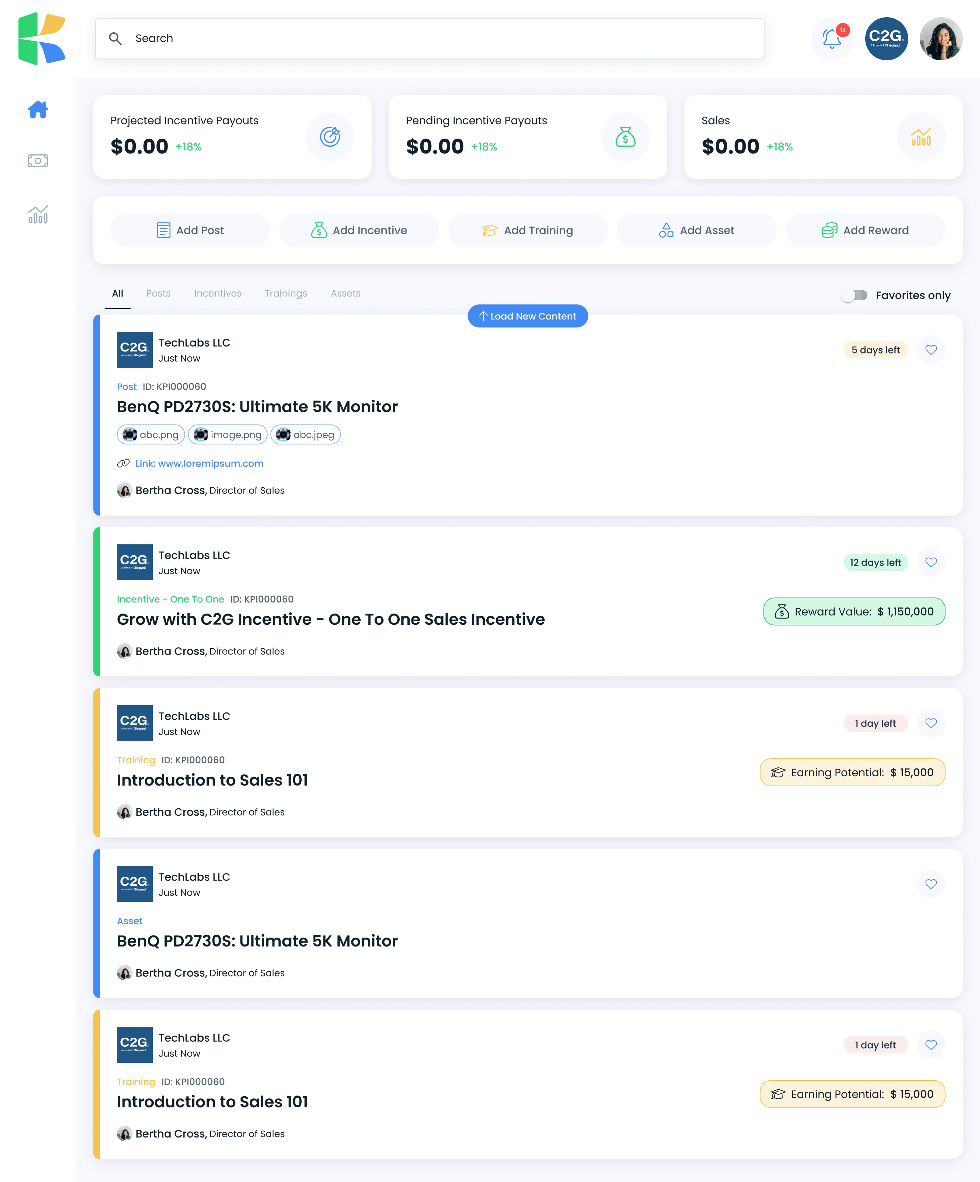
The feed is where four of the five surface. That is why it carries five content types instead of the product carrying five sections.
Priorities and sequencing
With one designer and six months, sequence was a design decision in itself.
Feed, content creation, and the incentive object, because nothing else has a reason to exist without them.
Payouts, states, splits, invoices. Credibility depends on this and it is the hardest to retrofit.
Training and rewards, turning enablement into something reps choose.
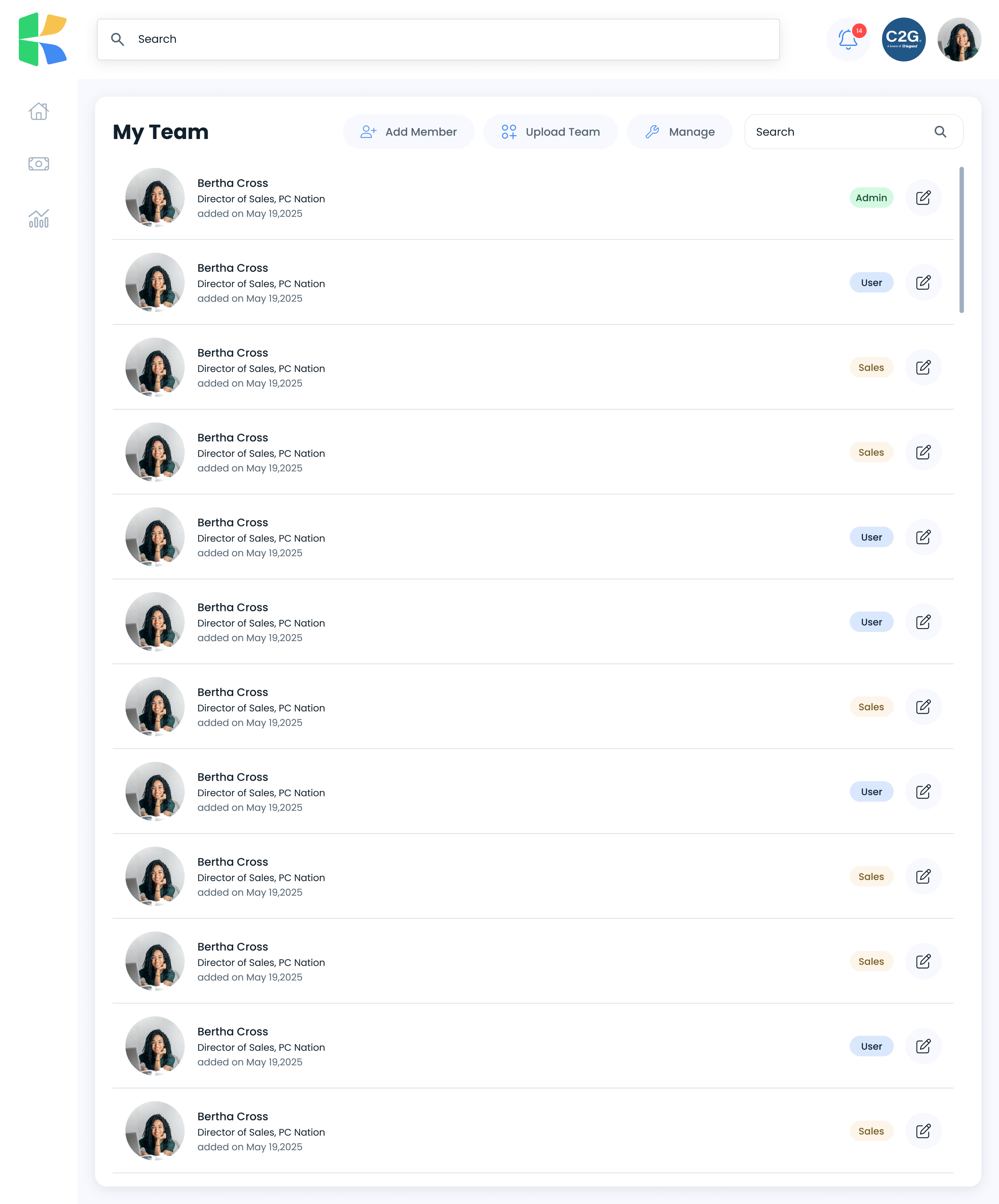
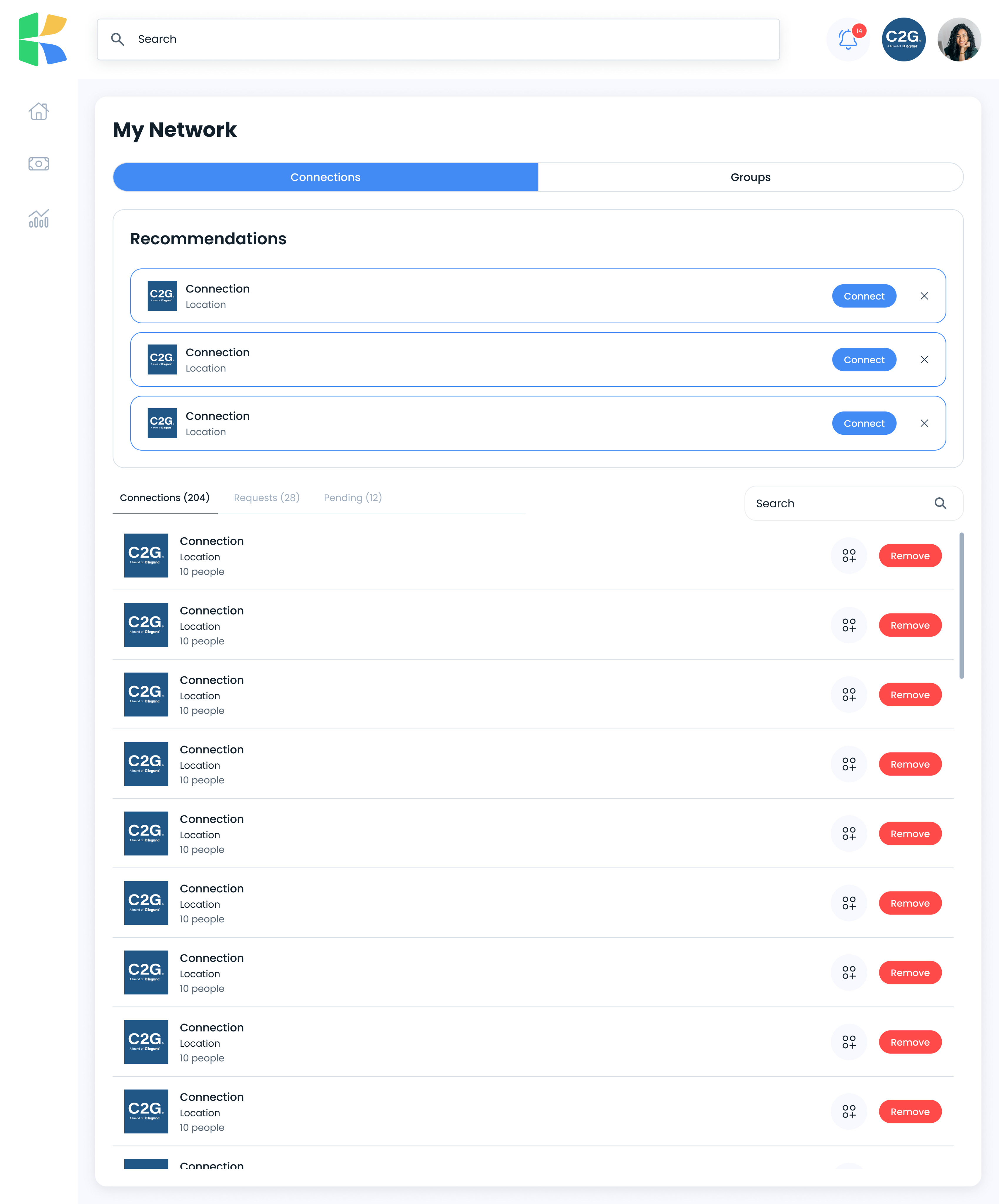
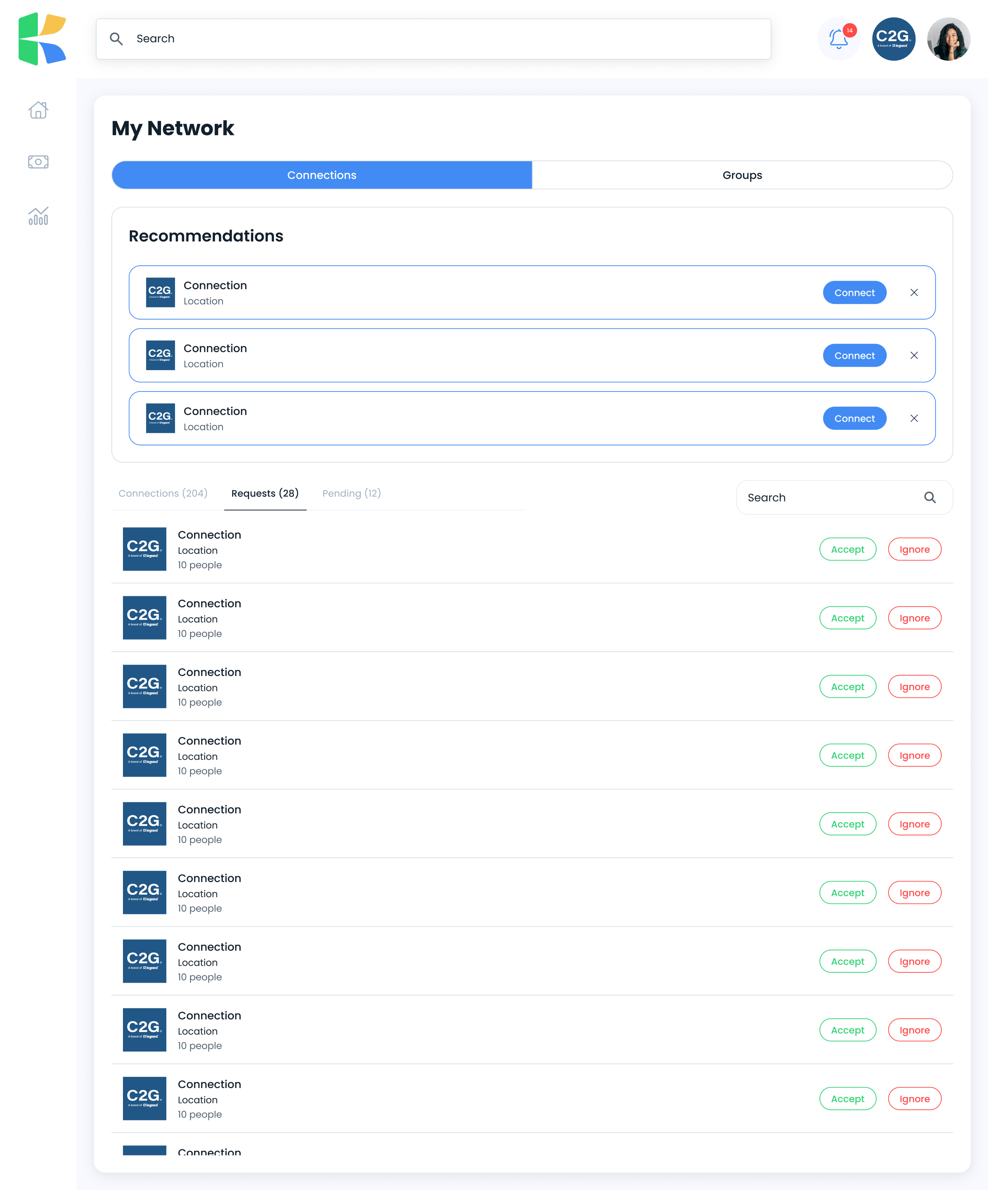
Connections, teams, groups, the relationships content travels along.
Settings, permissions, approval configuration, company profiles.
Foundations before components, components before screens.
03What made it hard
One designer, thirteen product areas.
Feed and content creation, incentives, training, payouts, invoices, sales data, network, team management, company settings, notifications, search, invites, and the marketing site. All from zero, in six months.
Money on every screen.
When an interface about money is ambiguous, the cost is not a support ticket. It is a dispute between two companies. Every figure needed a visible state and a traceable source.
Three audiences, one product.
A vendor creating an incentive, a manager approving it, and a rep earning from it need different things from the same object, without fragmenting into three products.
No direction to work from.
A clear vision from a CEO without a design background, and nobody else. No design director, no team, no strategy, and no precedent worth copying, since the premise was that the incumbents were the problem.
04Design decisions
Made one feed carry five content types.
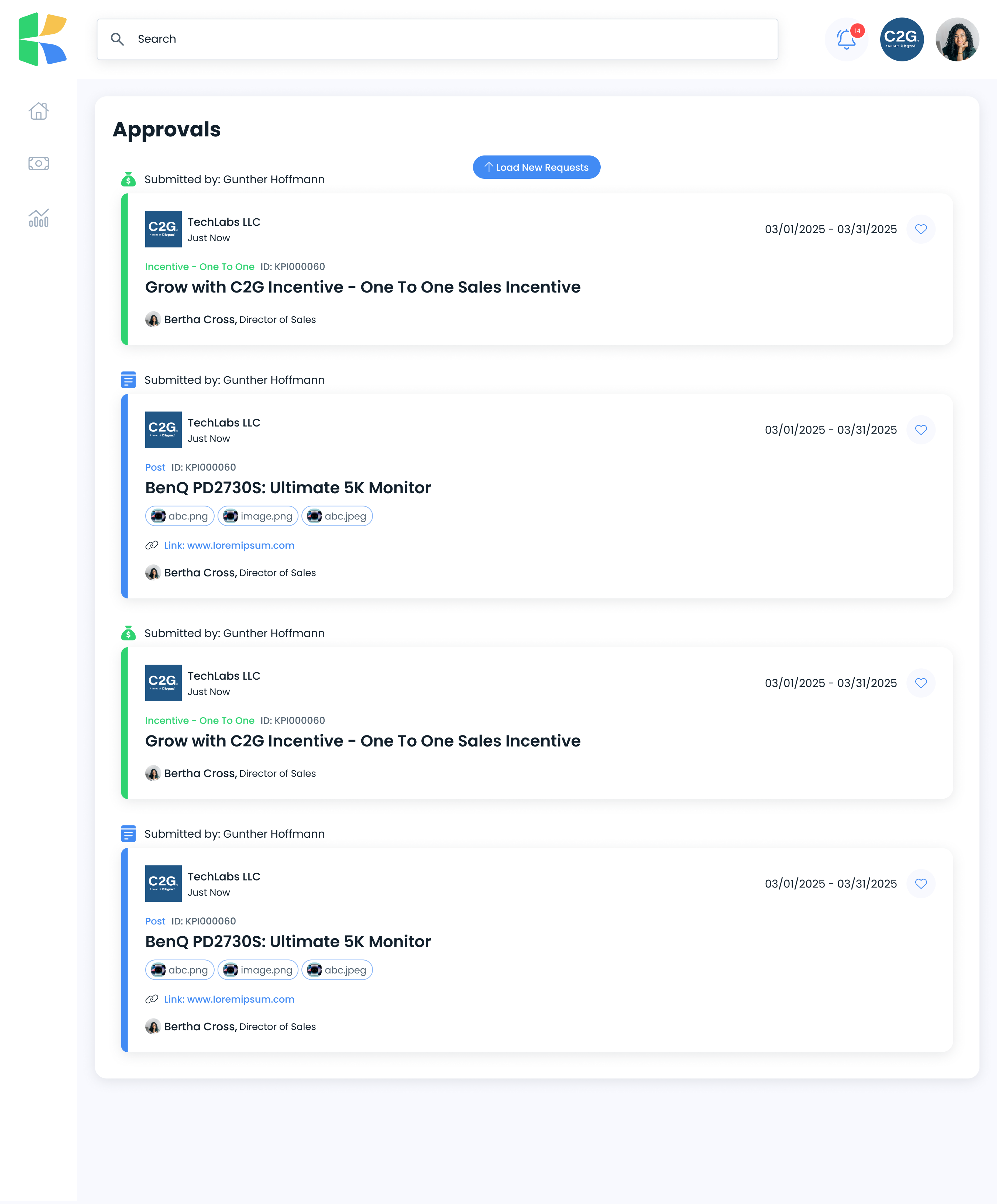
Posts, incentives, trainings, assets, and rewards flow through a single stream, distinguished by a colored left border and a labeled type rather than separate destinations. A partner checks one place instead of learning where each kind of thing lives.
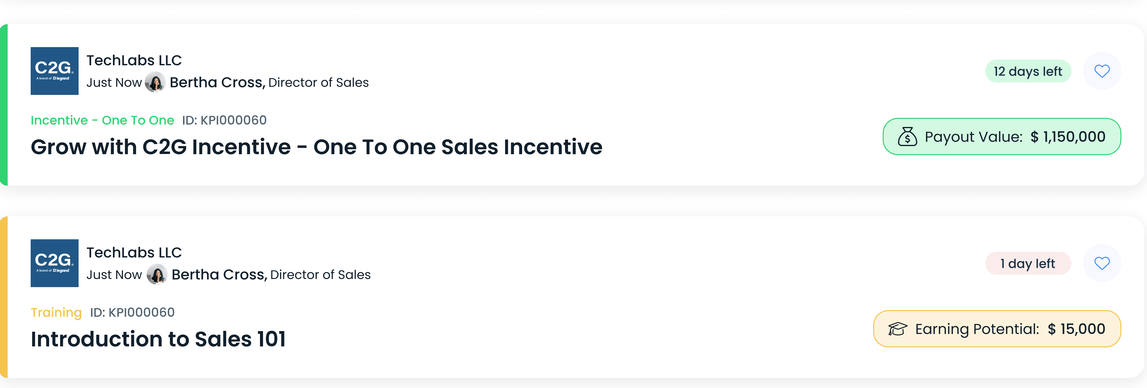
Put the money in the card, not behind a click.
Reward value, earning potential, and time remaining sit on the feed card itself. The decision a rep makes while scrolling is whether something is worth their attention, and that decision needs the number, not a link to it.
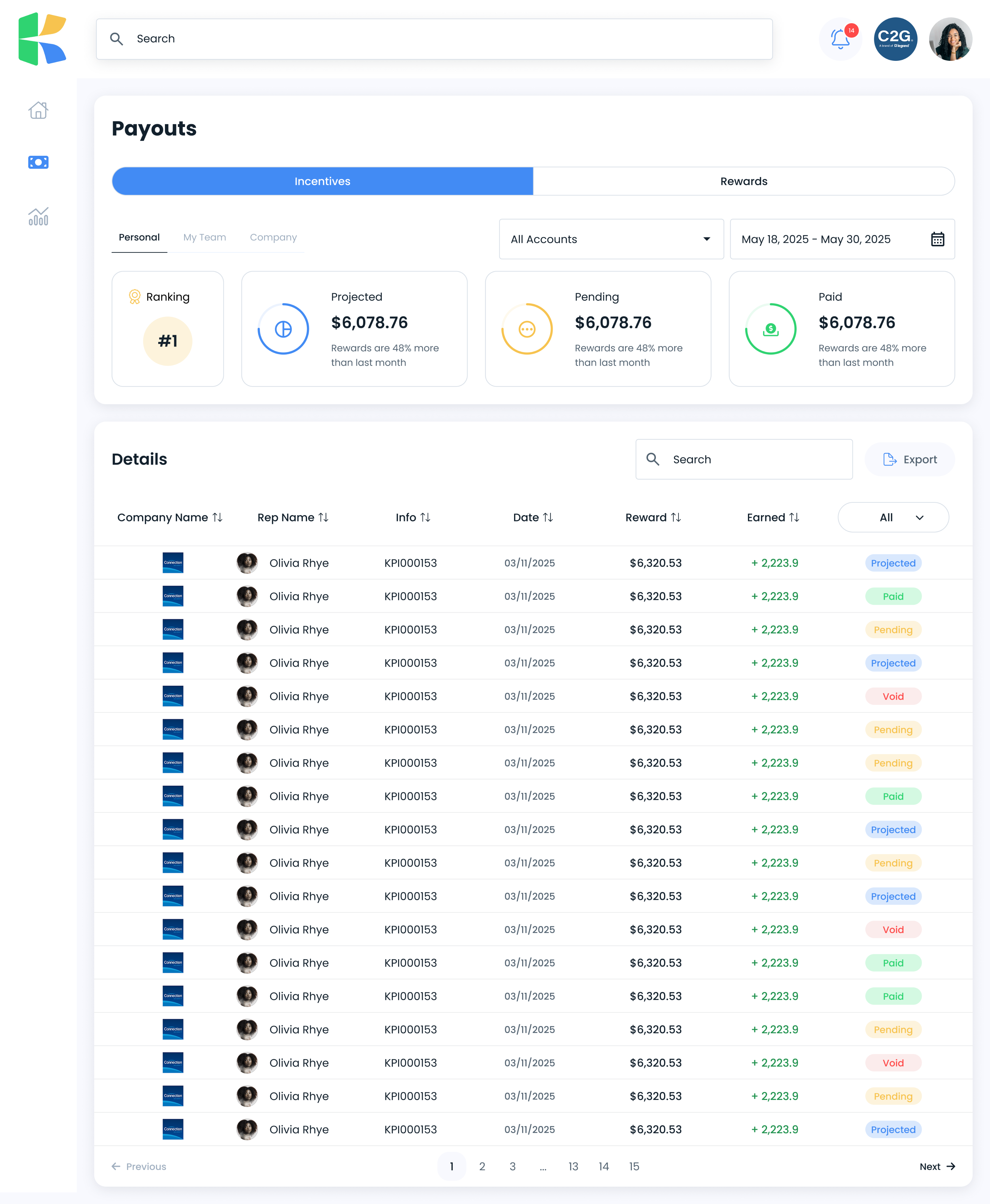
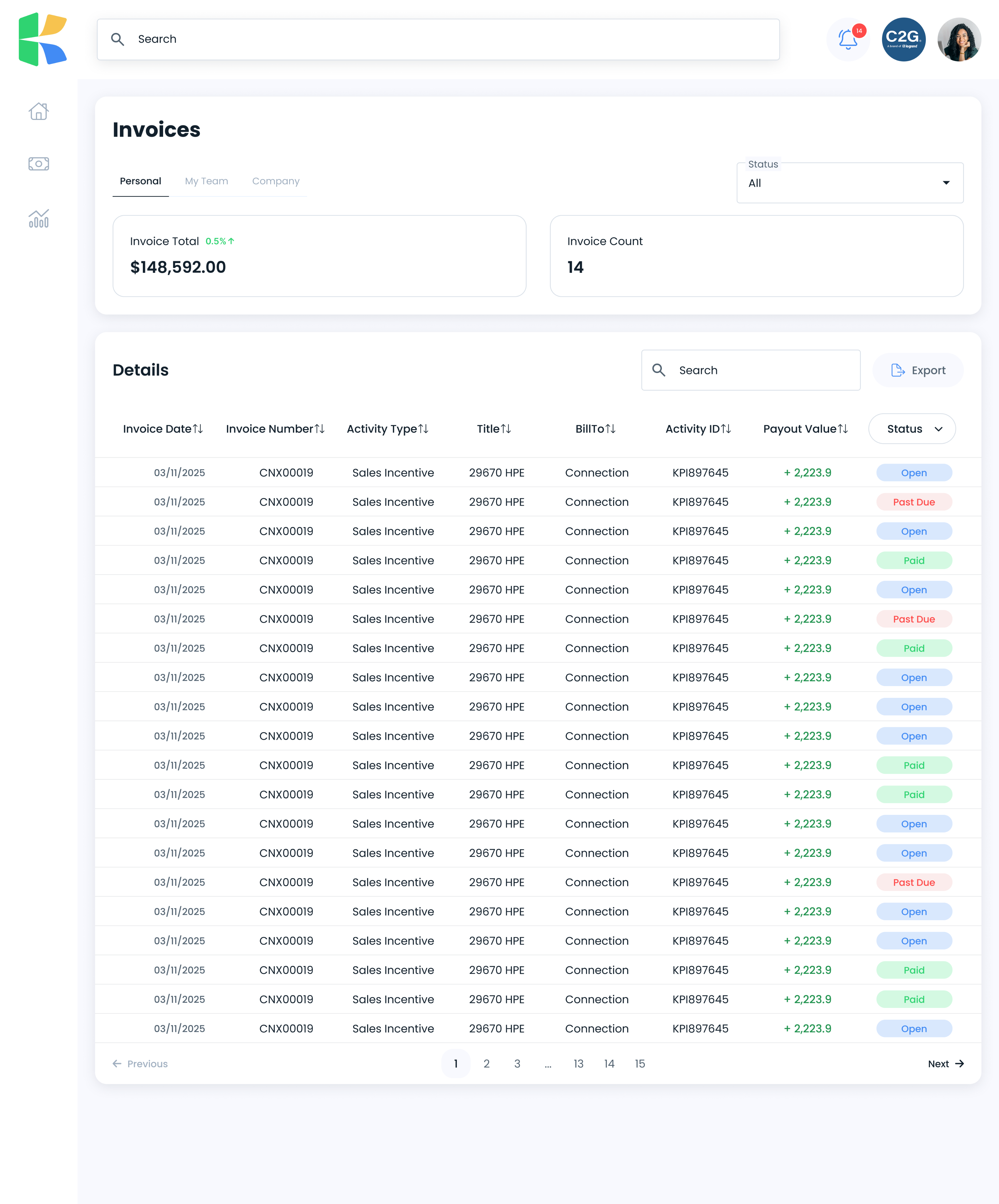
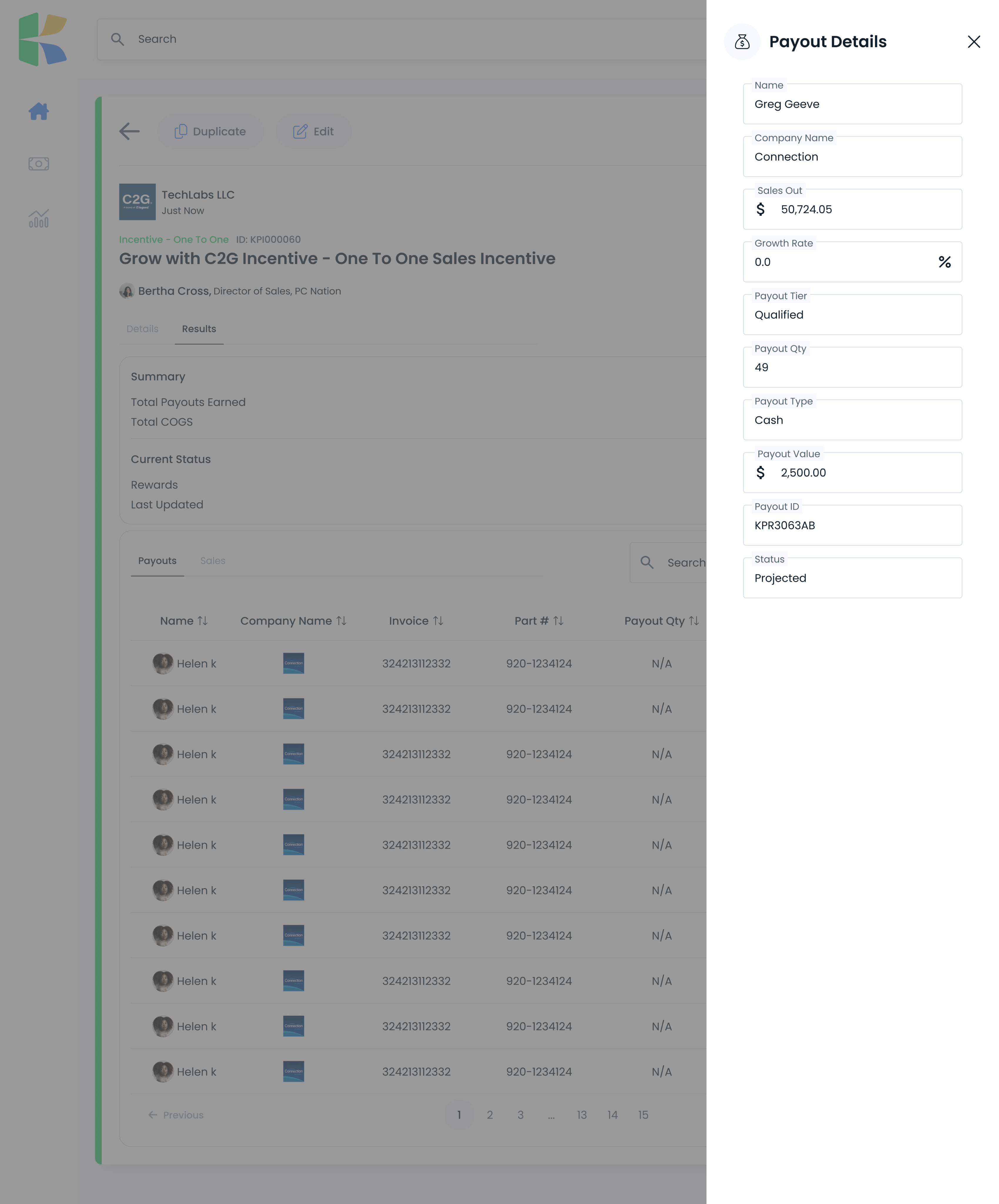
Gave every payout a visible state.
Projected, pending, paid, and void are distinct, color-coded, and present wherever money appears. Nobody has to ask whether a figure is a promise or a payment.
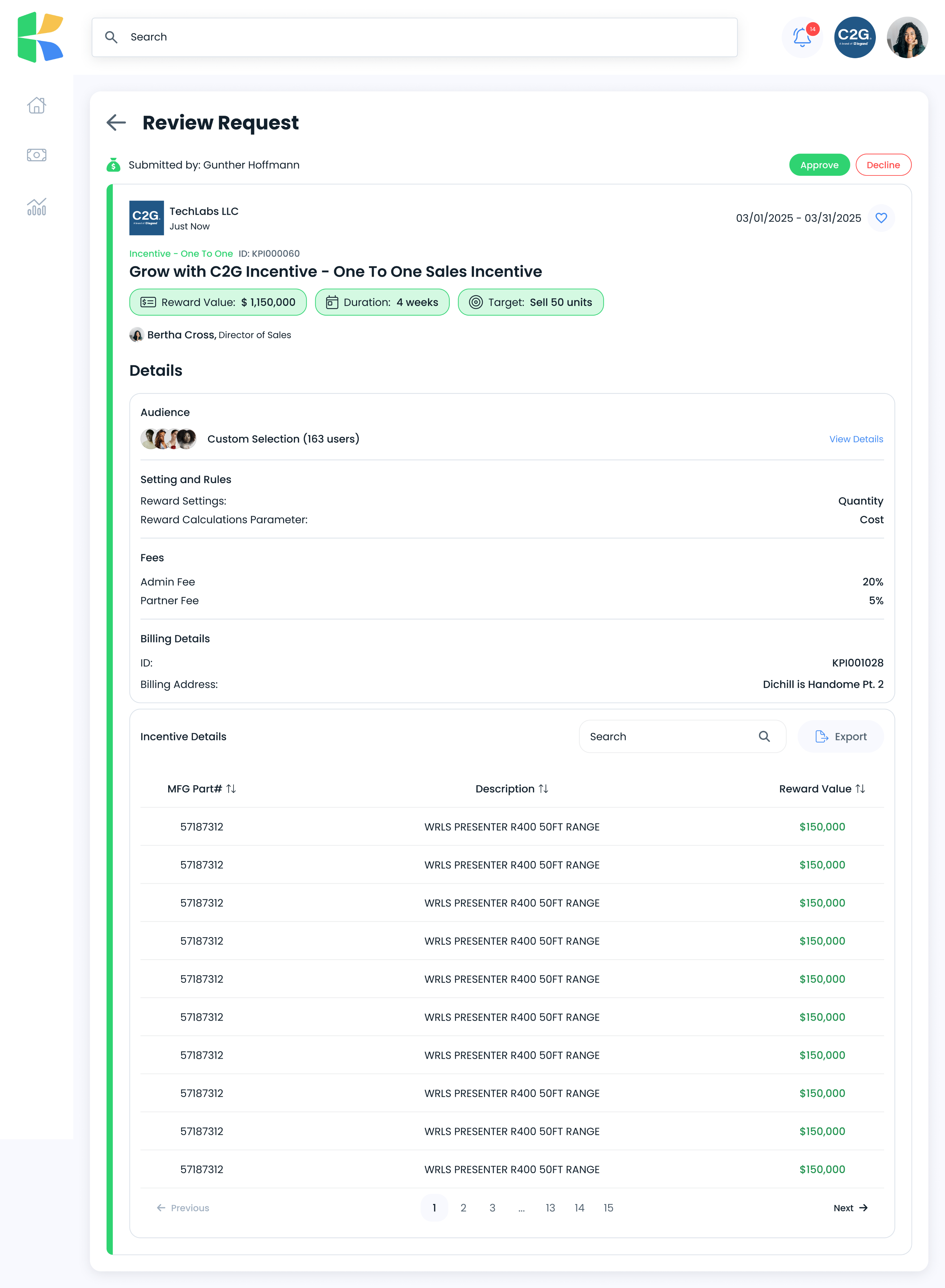
Treated approval as a designed experience, not a gate.
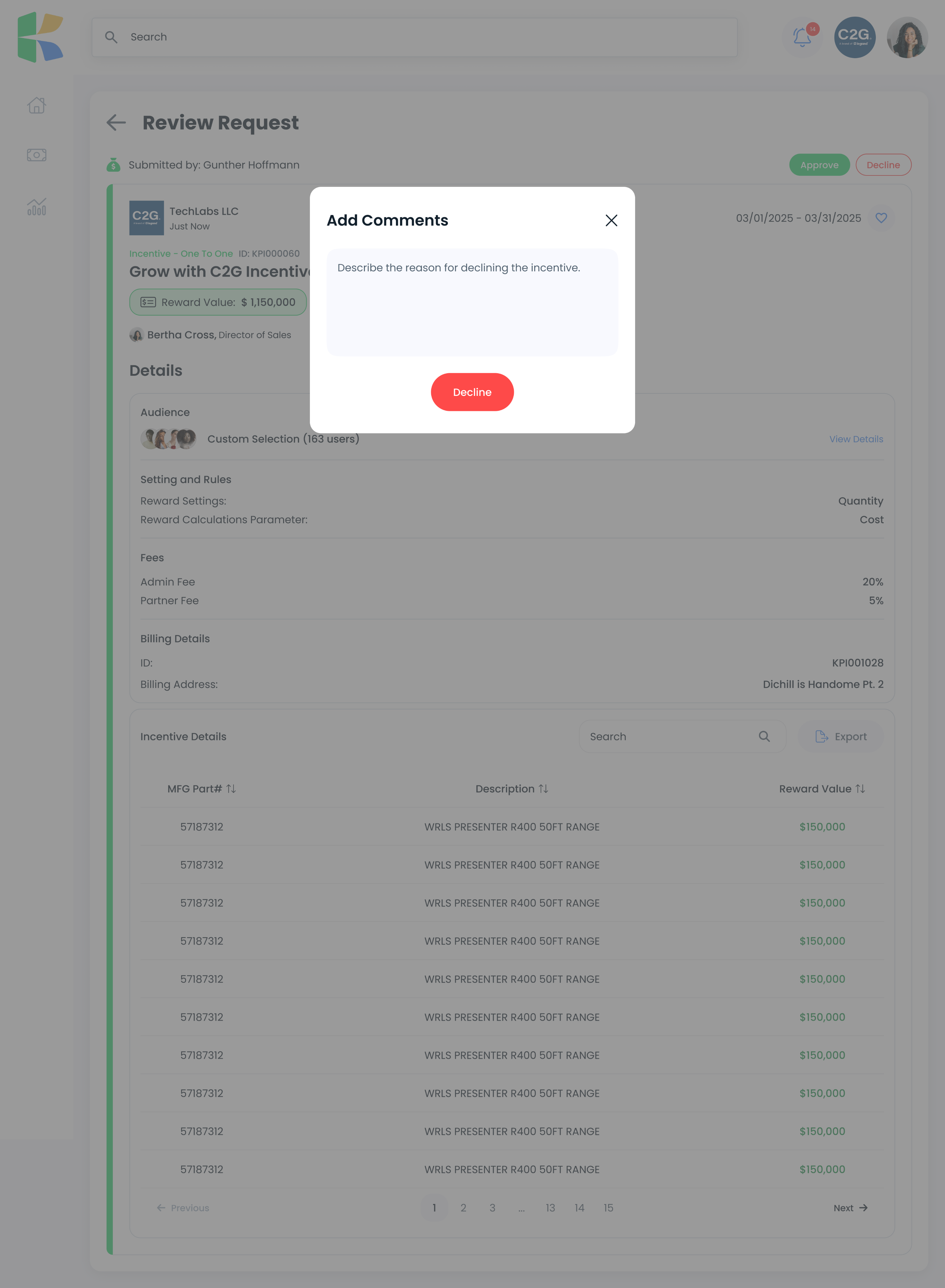
An incentive moves from submission, to review with approve and decline, to a required comment when declining, to a declined state where the submitter reads the manager's actual reasoning. The reason travels with the decision.
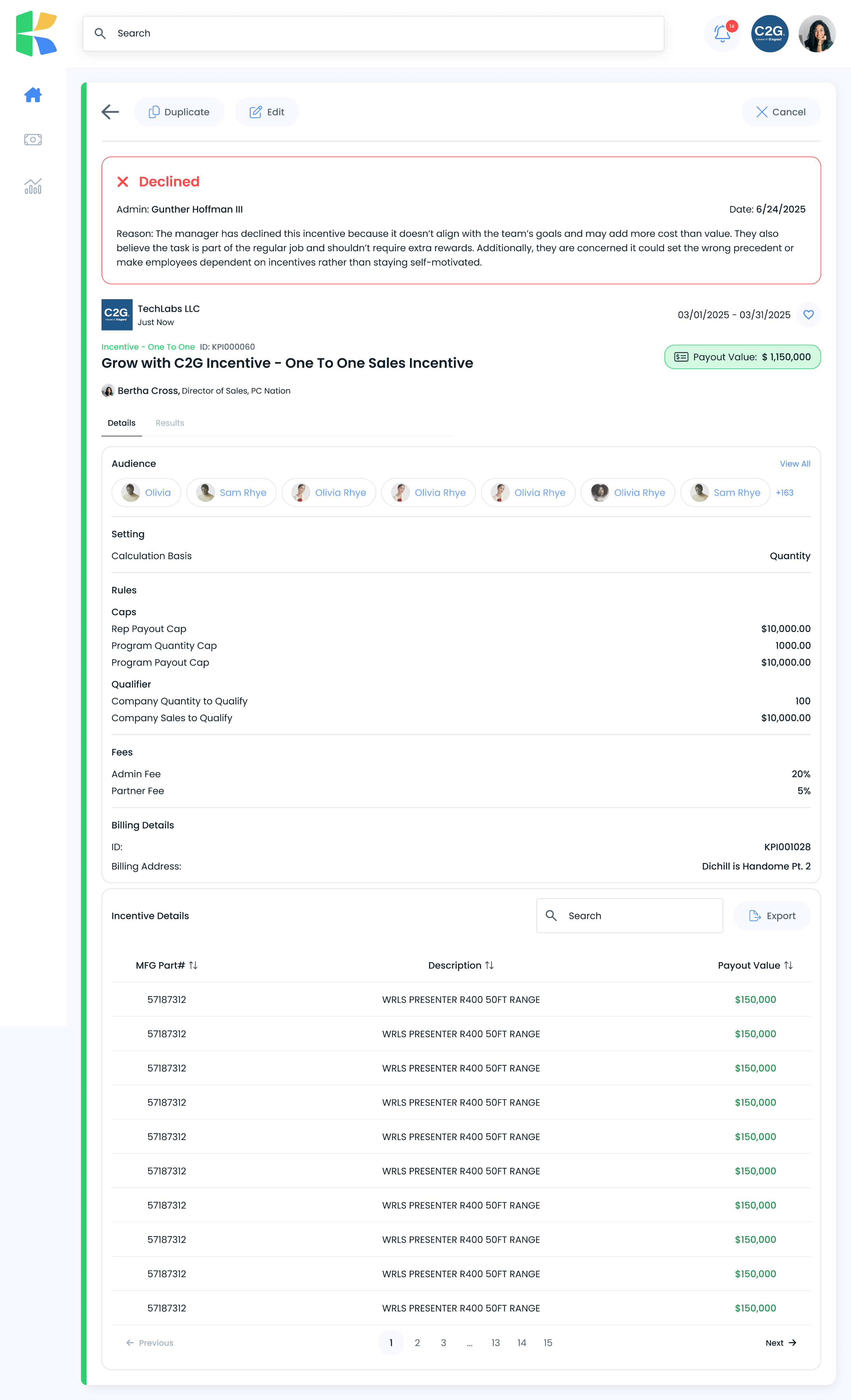
Made the decline reason visible to the person who received it.
Most systems make rejection a dead end. Here the manager's full reasoning sits at the top of the declined incentive.
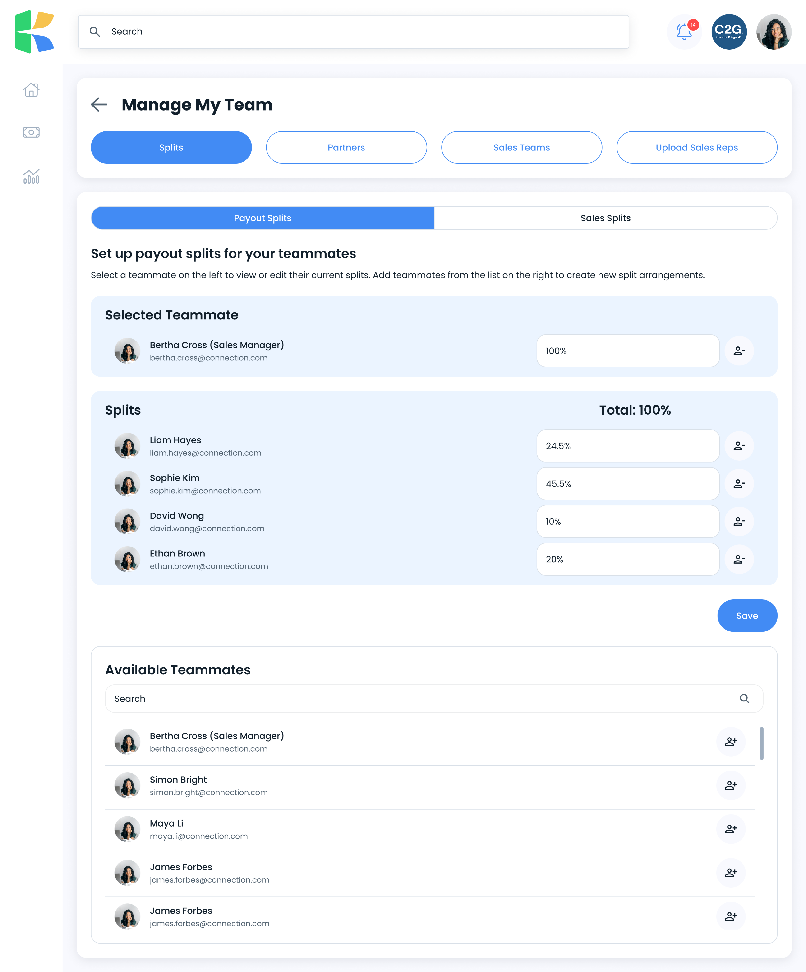
Made splits show their own math.
Payout splits across teammates display a running total against 100%, with add and remove per person. The constraint is enforced by making it visible rather than by failing validation afterwards.
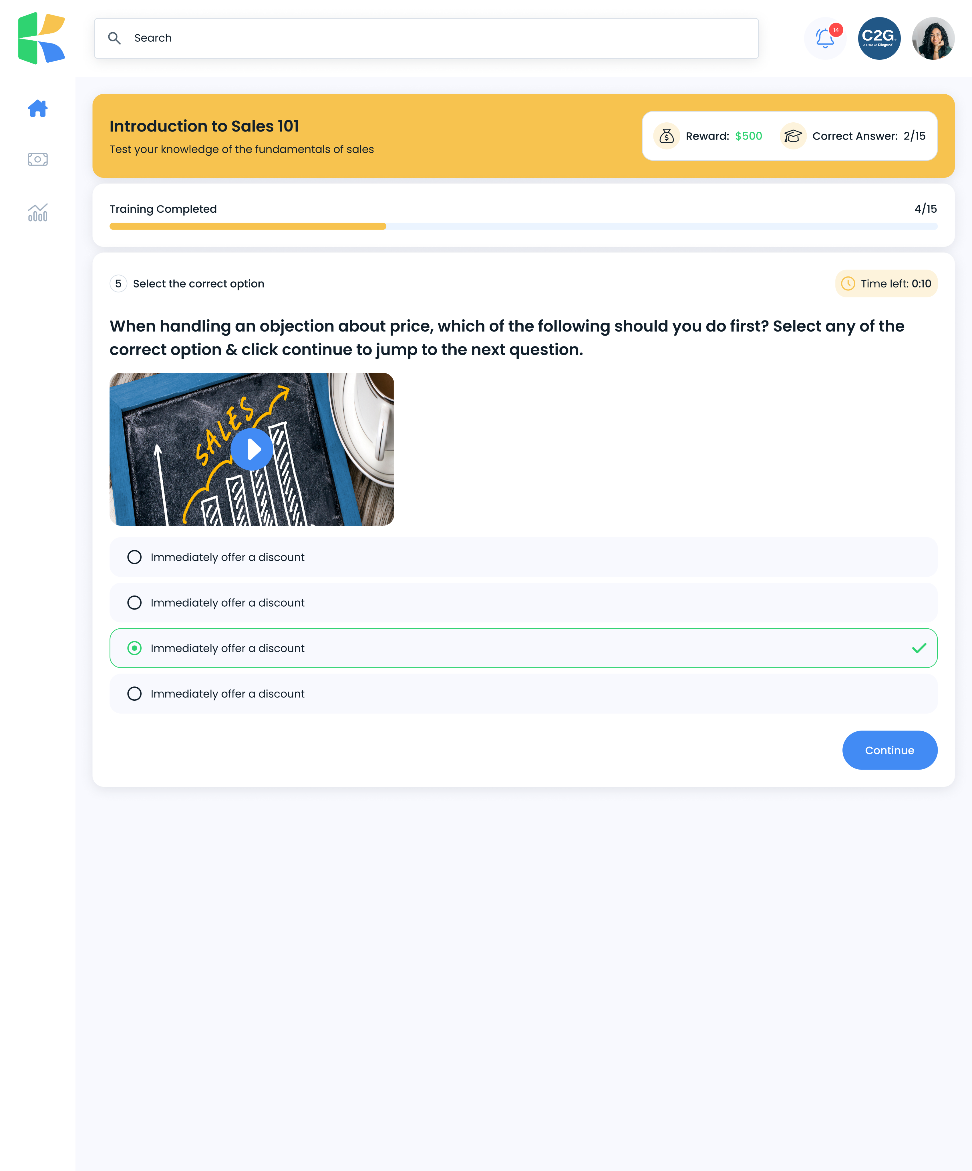
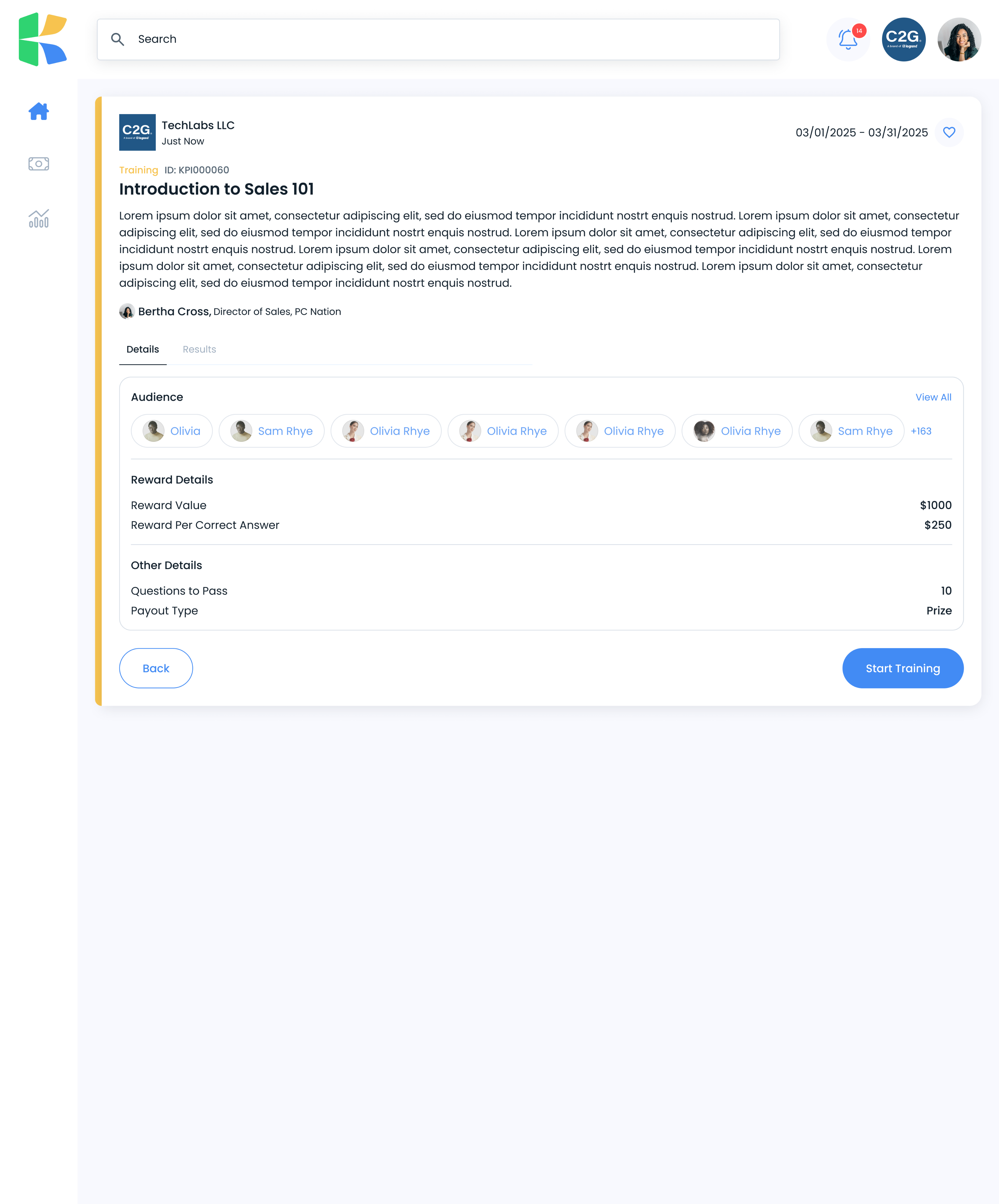
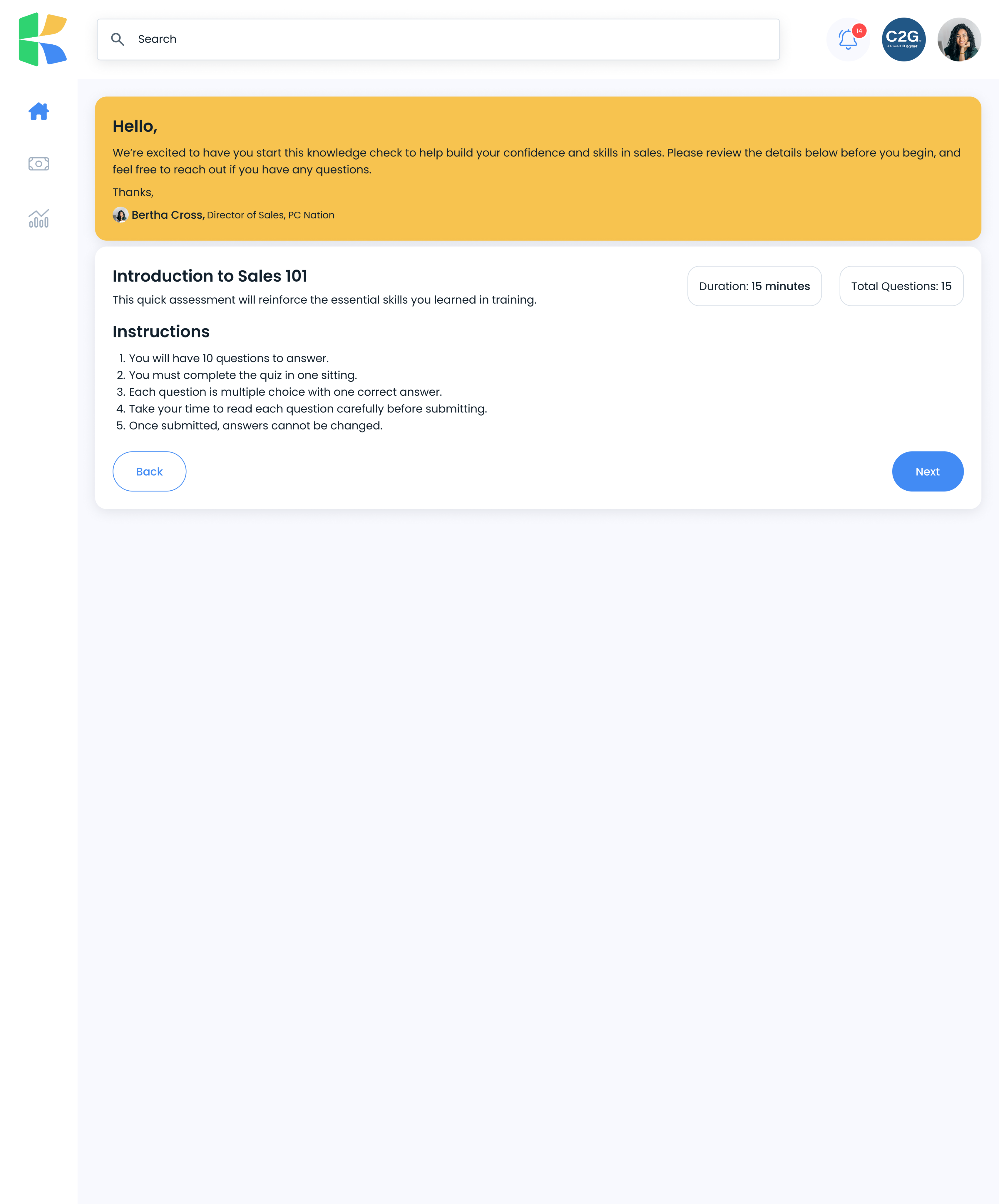
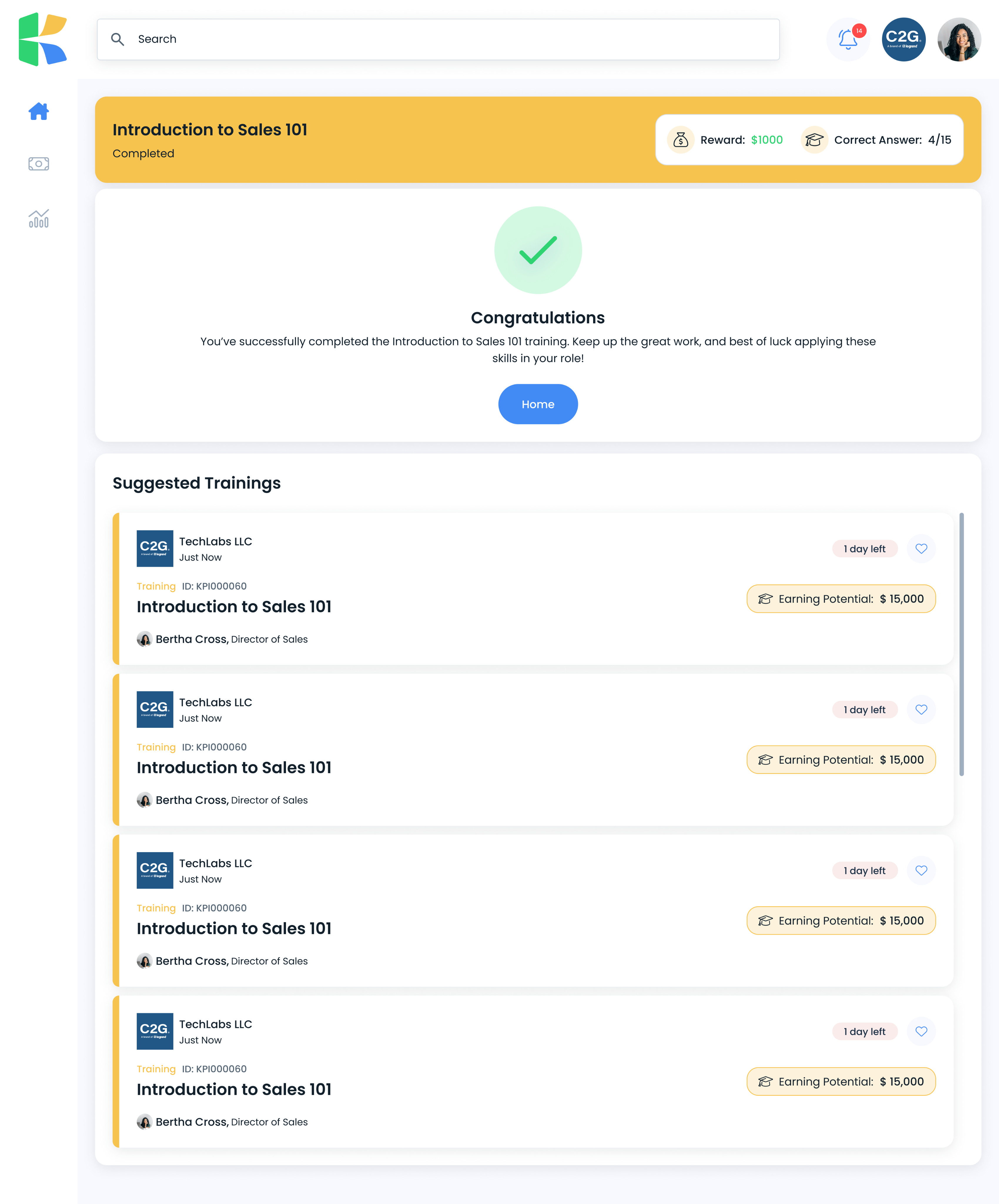
Built training as a loop with a payoff.
Instructions, a timed quiz with visible progress, a completion screen showing reward earned and correct answers, then suggested next trainings. Learning is tied to earning.
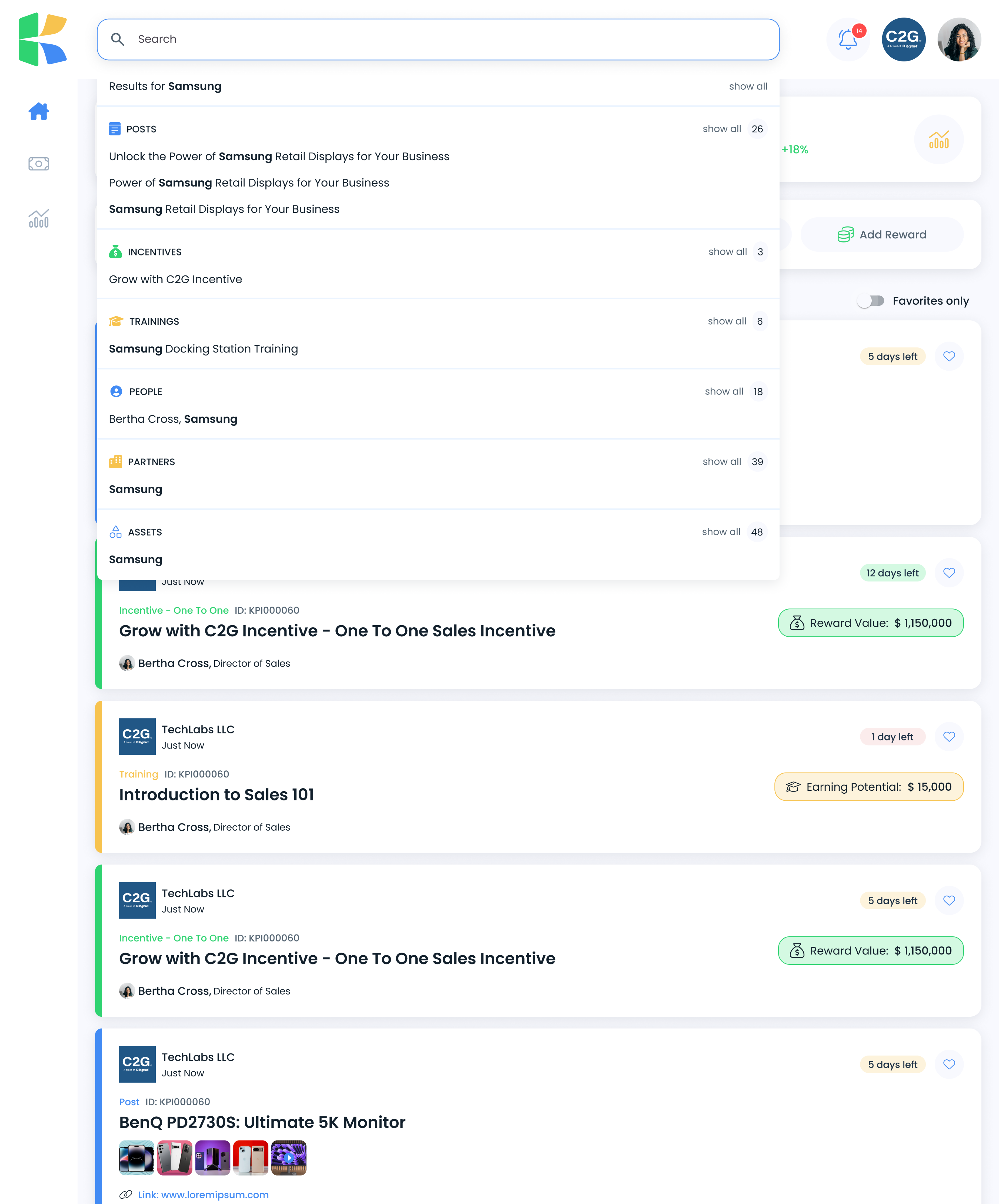
Made search span the entire product.
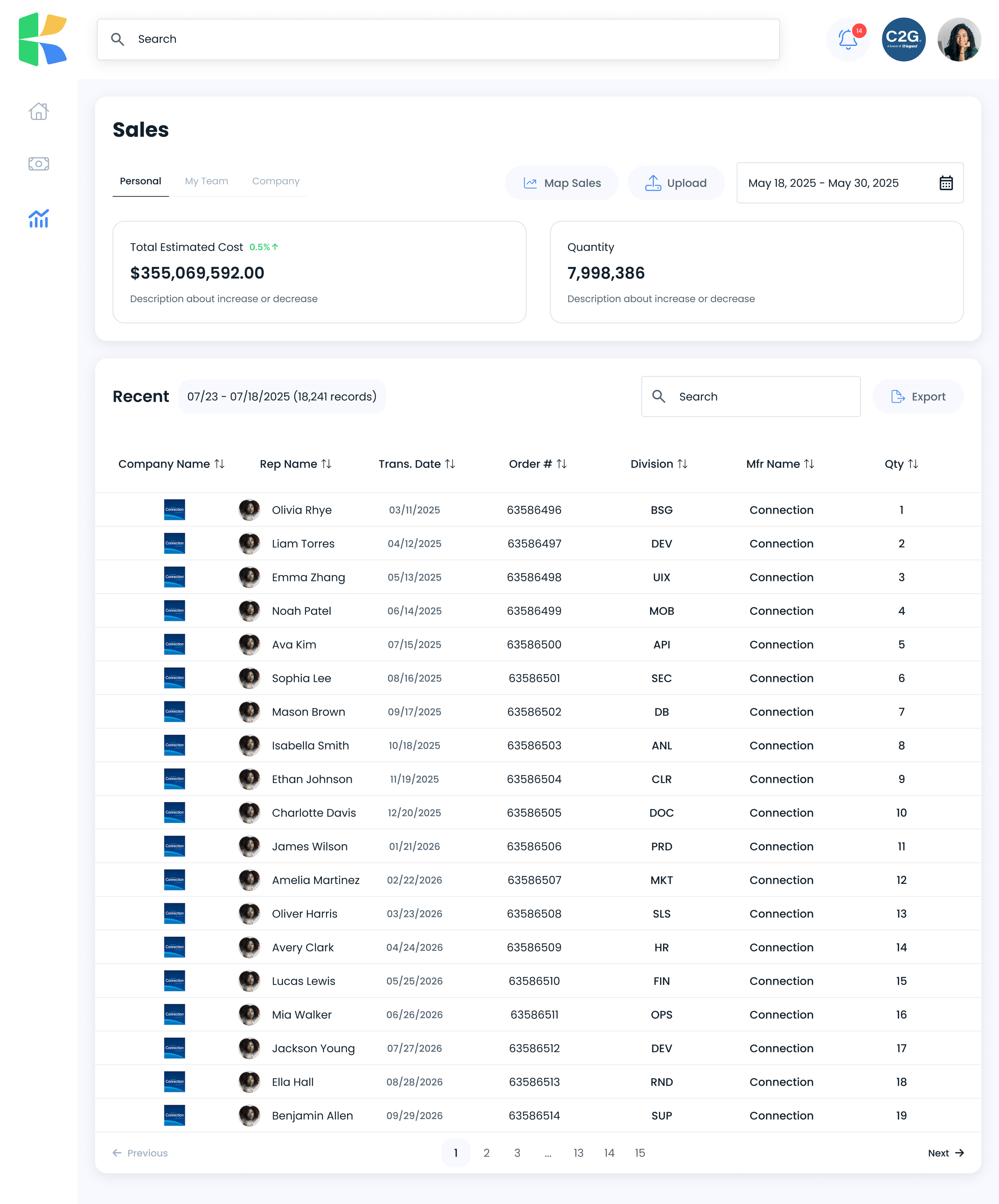
One field returns typed, grouped results across posts, incentives, trainings, people, partners, and assets, each with counts. In a product with thirteen areas, search is the navigation.
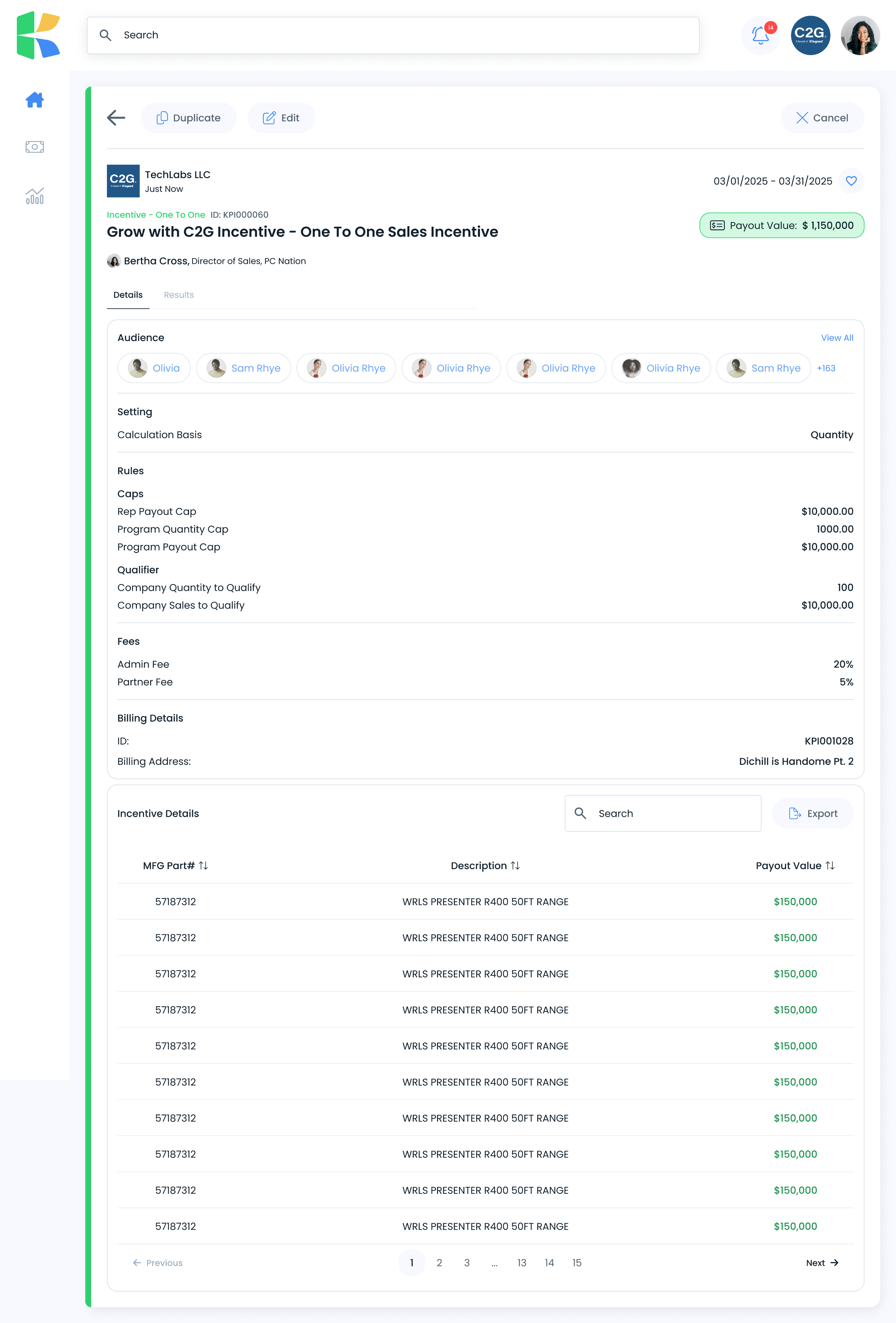
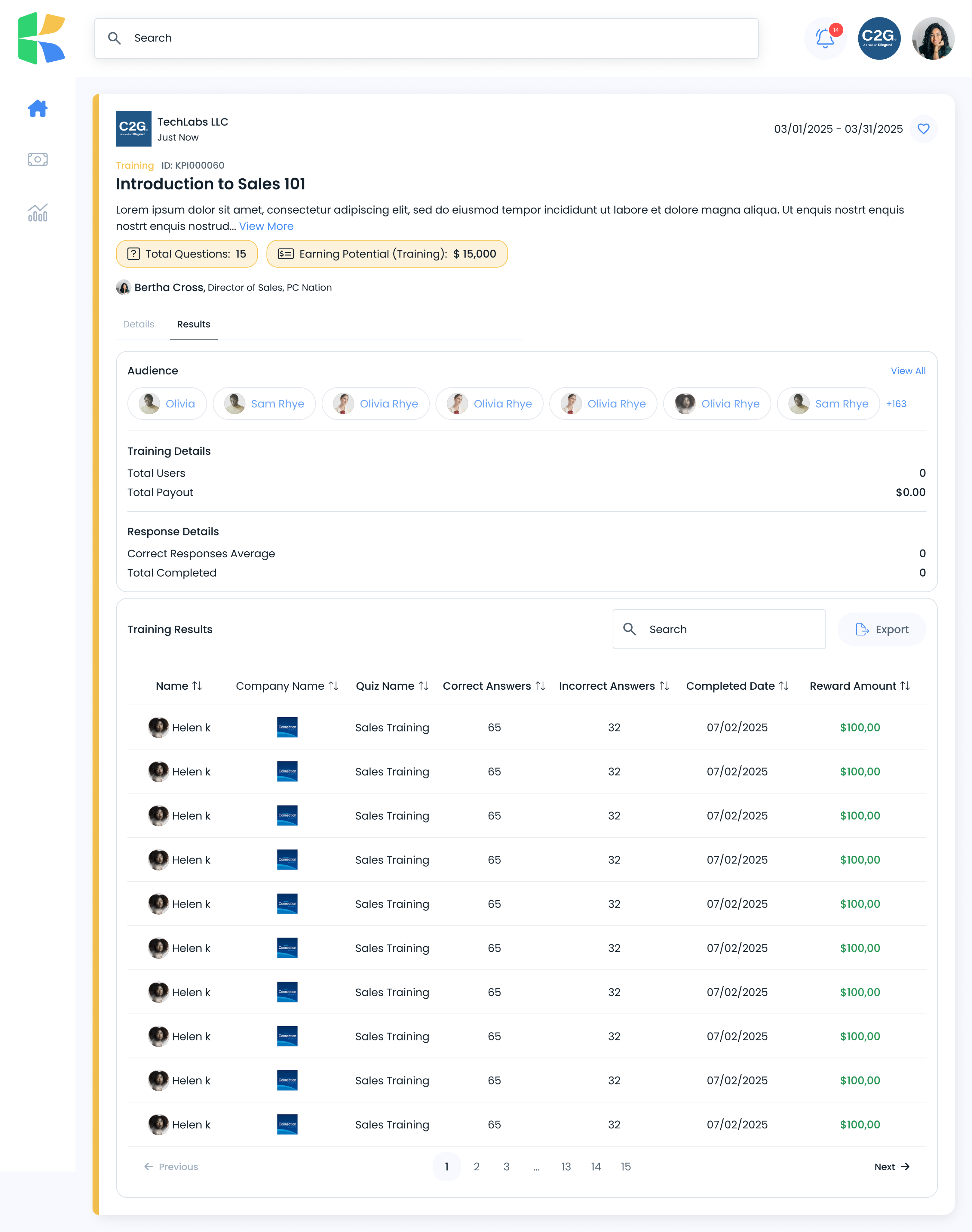
A ninth decision has no screenshot: containing the complexity of incentive setup. A single incentive carries audience, calculation basis, rep and program caps, qualifying thresholds, admin and partner fees, and billing details. Rather than one long form, the object separates into Details and Results, with rules grouped by kind. The complexity is arranged, not hidden and not dumped.
05The design system
Built from nothing, in parallel with the product.
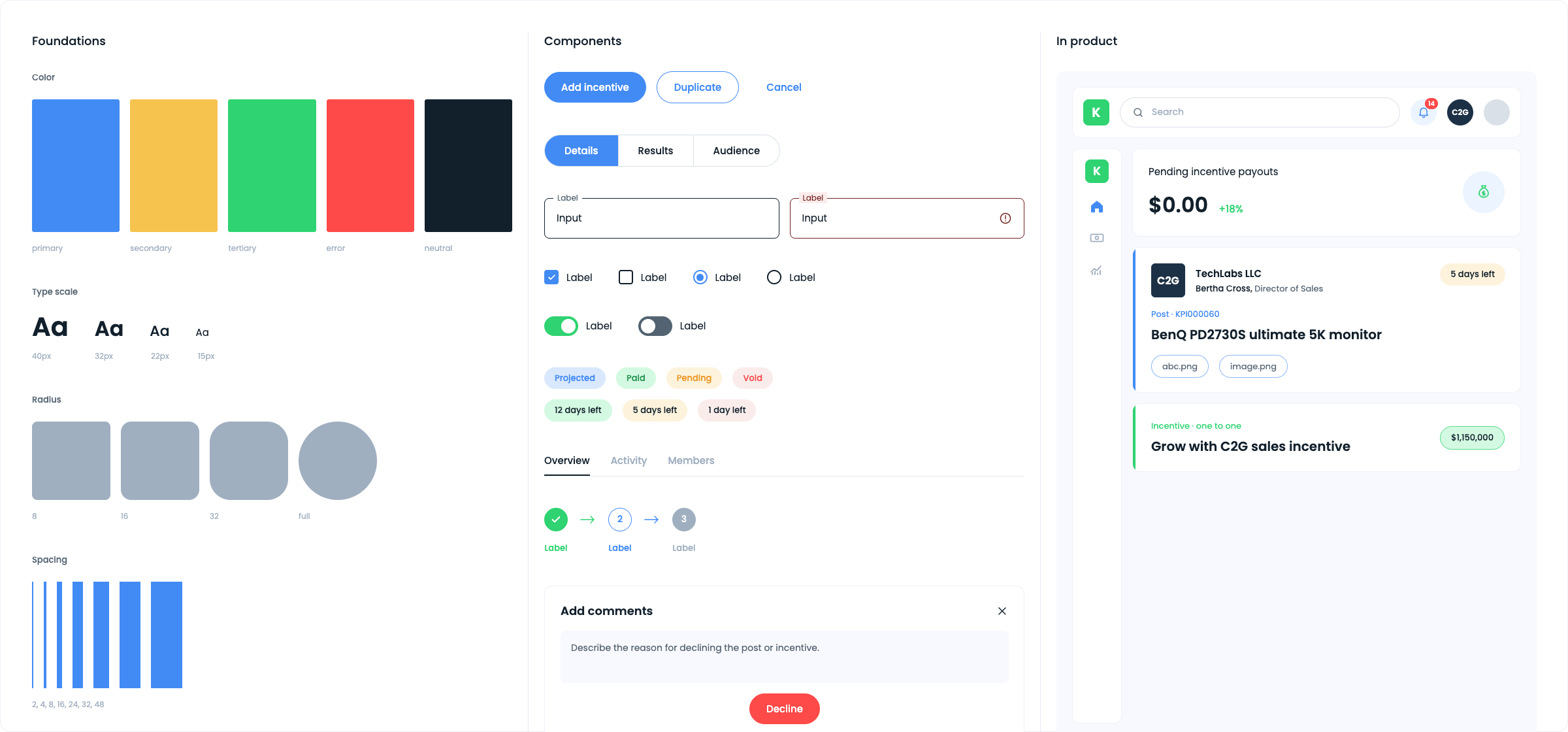
I started at the foundation: typography, color, structure, grid, spacing, and border radius. Then tokens and the component library on top of it, covering navigation, icons, form fields, buttons, radio buttons, checkboxes, segmented controls, tabs, tables, graphs, layouts, and assets. Every element in the product traces back to that foundation.
The evidence is in the consistency. Across thirteen product areas, tables behave the same way, status pills use one vocabulary, empty and populated states share a structure, and a single card pattern carries five content types. A system is not a deliverable you produce at the end. It is the thing that lets one designer cover a whole product.
06Leading without a team
I owned the entire product. The two interns were people I was teaching, not people the work was delegated to.
What I mentored them on: how to work in Figma properly, how to think about product rather than screens, how to strategize, how flows actually work, how to design for efficiency and usability, how to run user testing, what to look for when analyzing research and results, and what to attend to while wireframing and prototyping.
With the CEO, the work was translation: taking a vision held by someone without a design background and turning it into product strategy, business and user alignment, and a shipped product.
07Outcomes
Everything in this case study shipped to production. Thirteen product areas, the full design system underneath them, and the marketing site, delivered inside six months by one designer.
What the business got
The CEO's vision became a working product. His assessment of the work was unambiguous: what he had described, I built.
08The full product
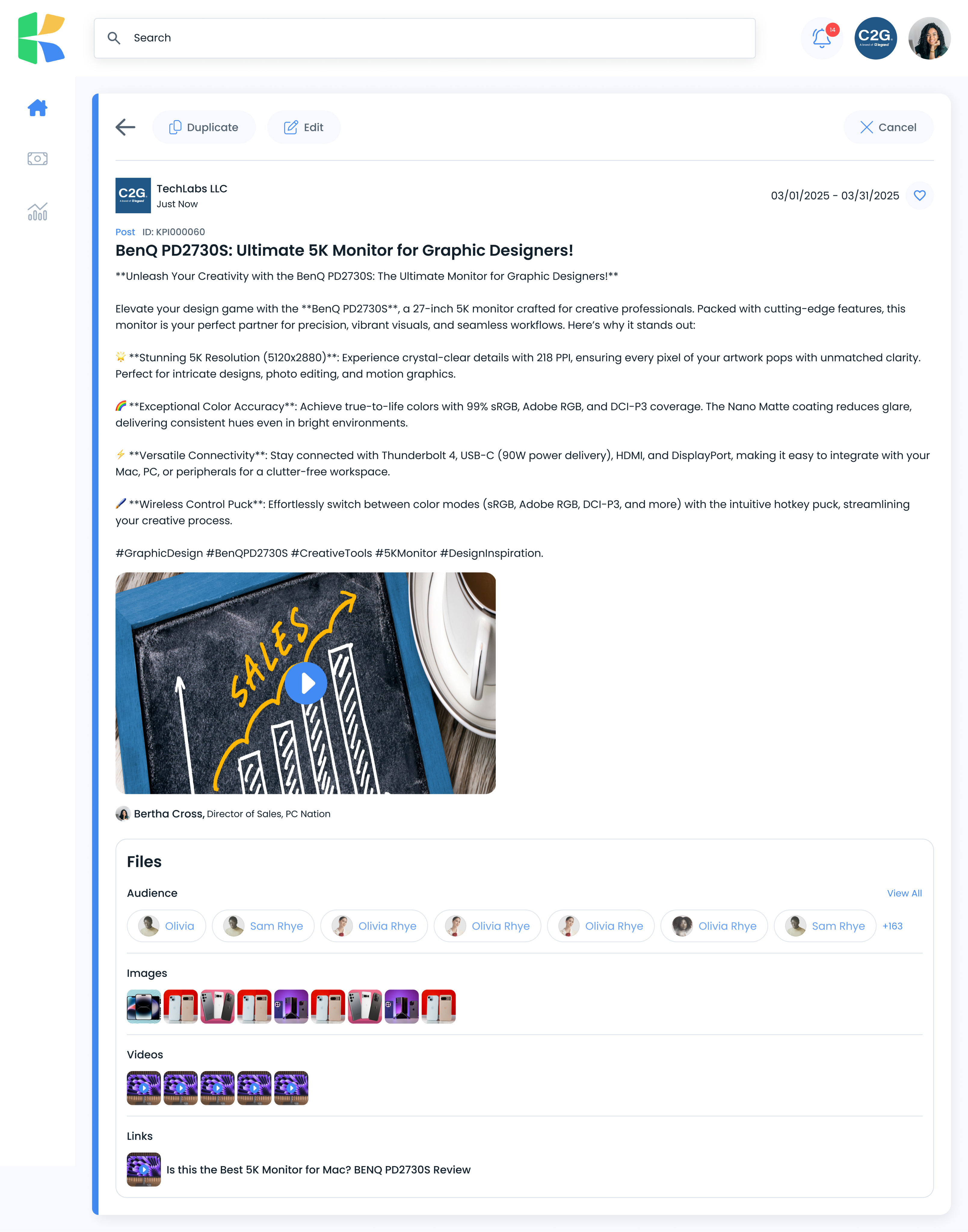
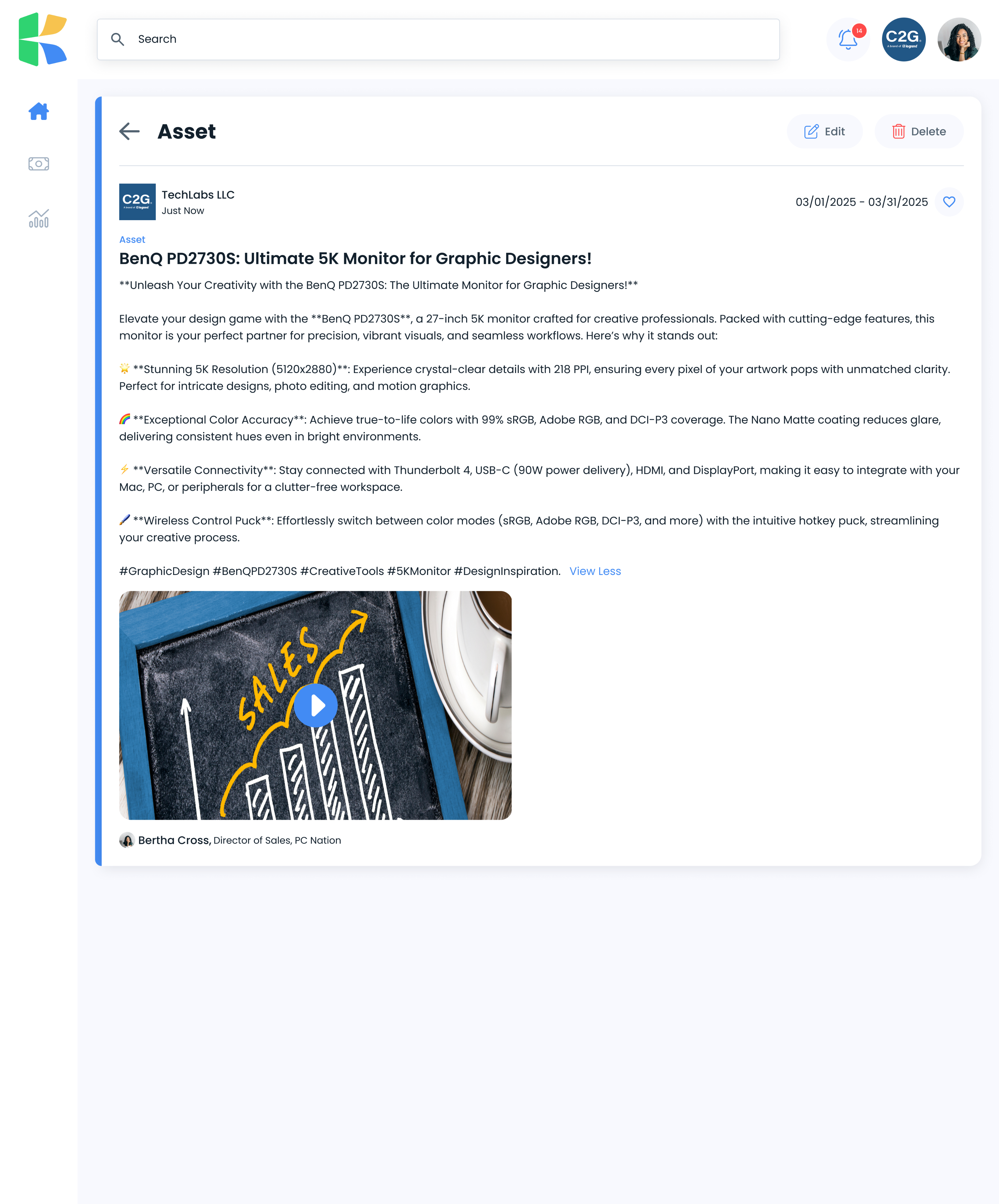
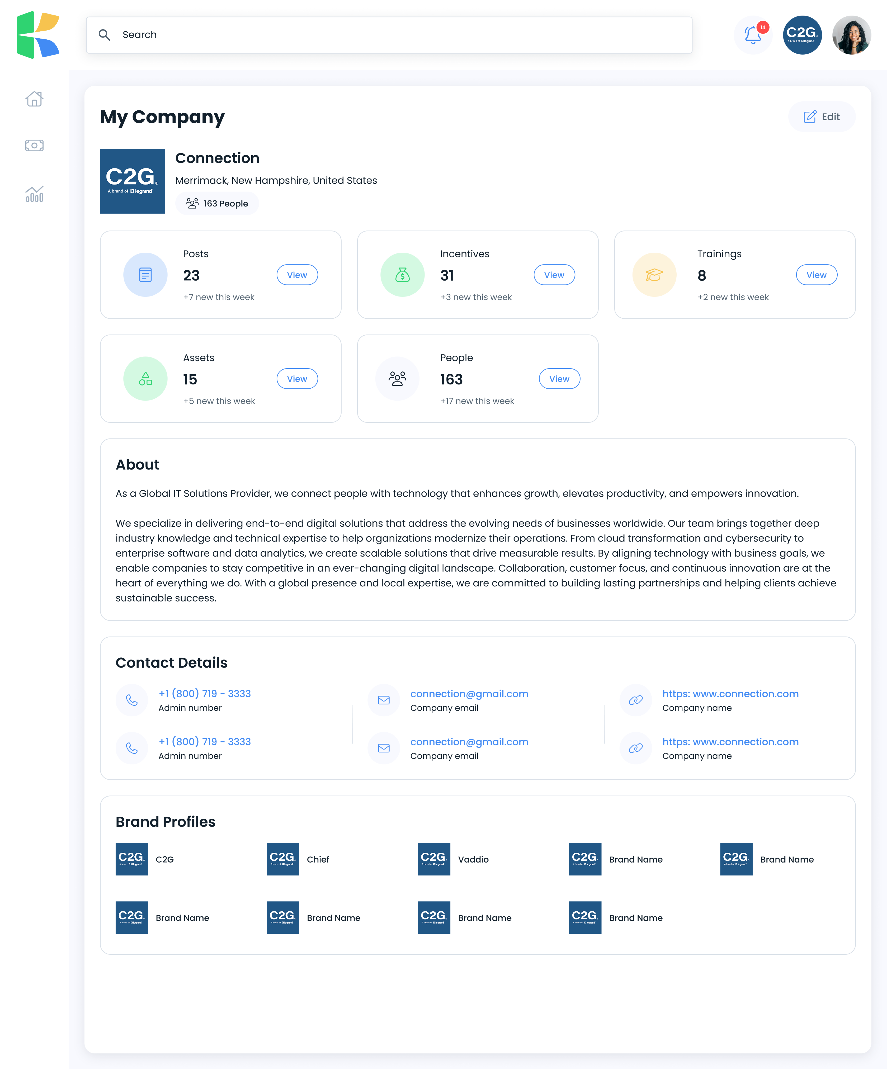
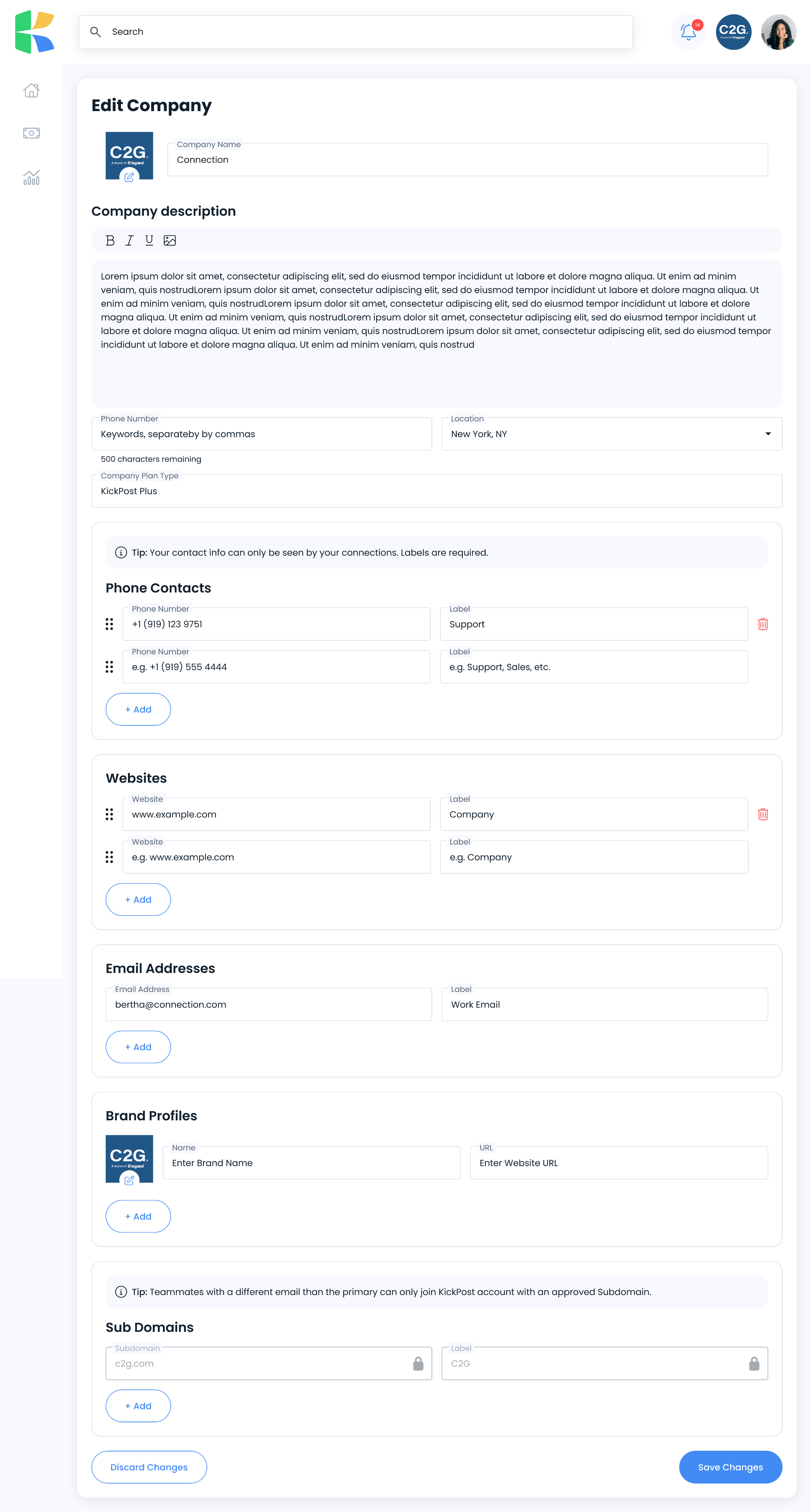
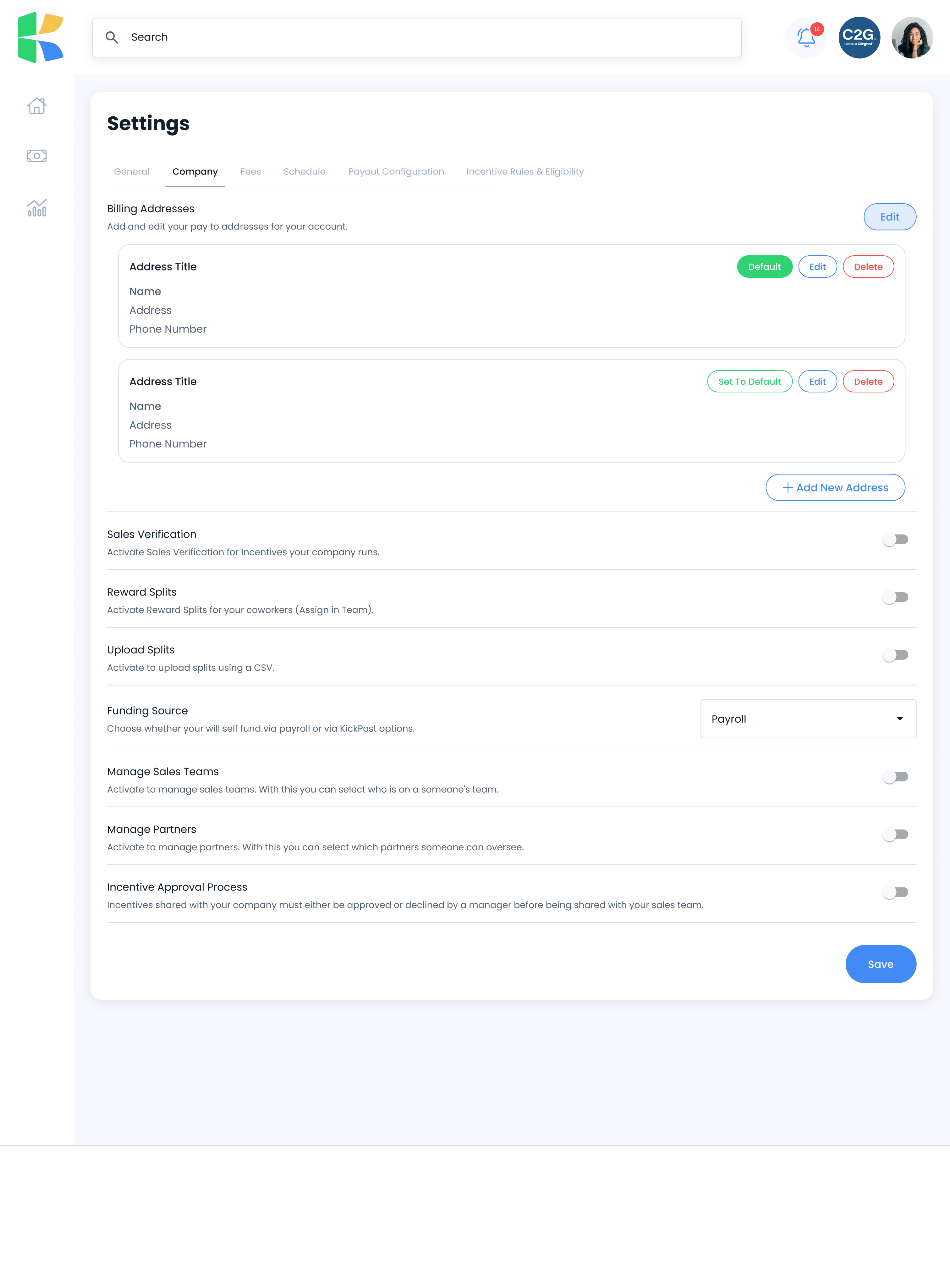
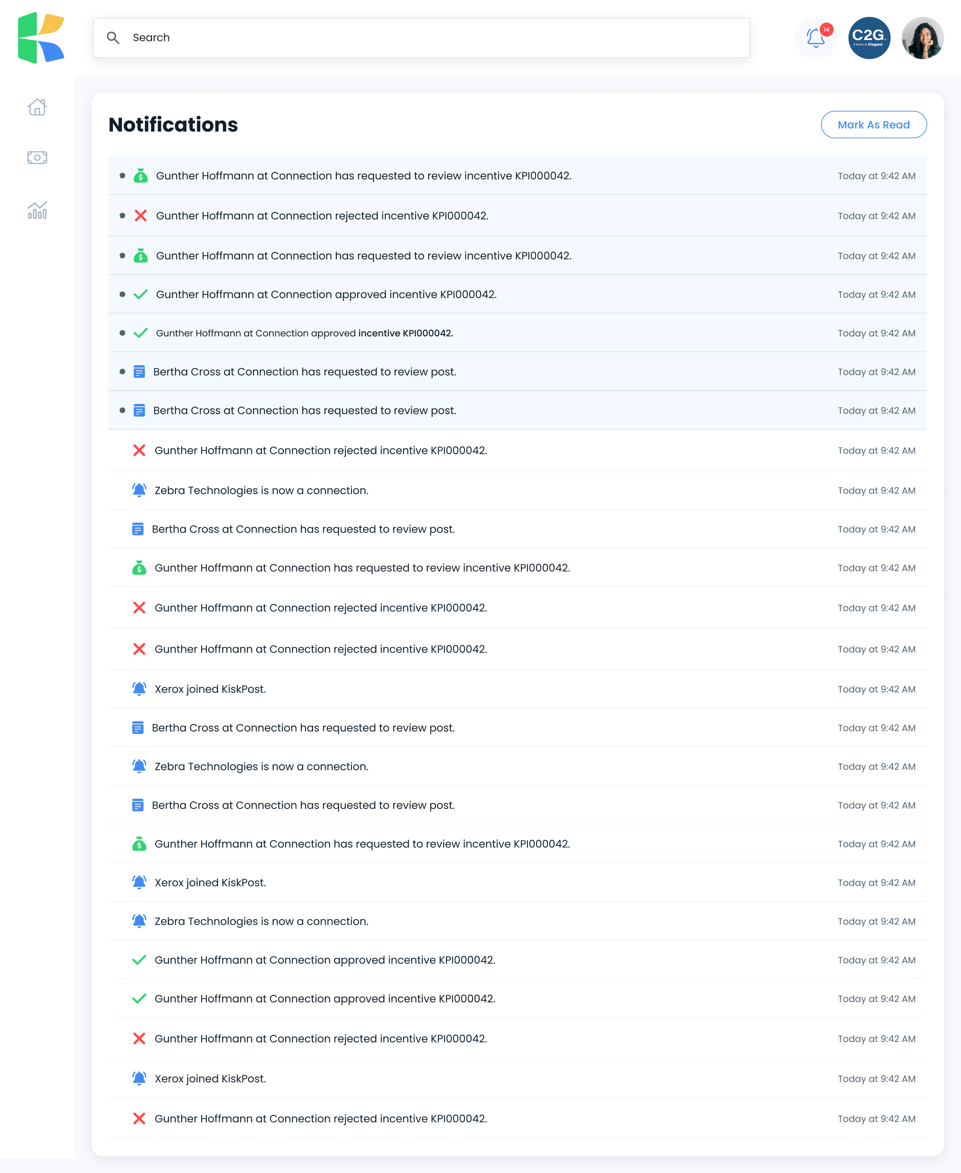
Thirteen product areas, built and shipped in six months by one designer.
09What I took from it
Direction is a deliverable. Established companies hand you a design organization, a strategy, and a direction to work within. Here there was a CEO with an idea and nothing else. When there is no design director, no team, and no strategy to inherit, the first thing you design is the direction itself.
A system is what makes scope possible. Thirteen product areas in six months was not a matter of working faster. It was a matter of deciding foundations once and then not re-deciding them.
When money is on screen, states matter more than layouts. Projected, pending, paid, and void carried more weight than any visual decision on the page.
Teaching sharpens the work. Explaining to interns why a flow works the way it does is the fastest way to find out whether it actually does.
One designer, six months, an entire product. The strategy was the first thing I had to design.