The app did one thing. So customers called about everything else.
A servicing app used by 3.5 million mortgage customers. It could take a payment and little more, so the people who had already automated their payment had no reason to open it at all. Six months to rebuild it as one product, shipped March 2026.
01The problem
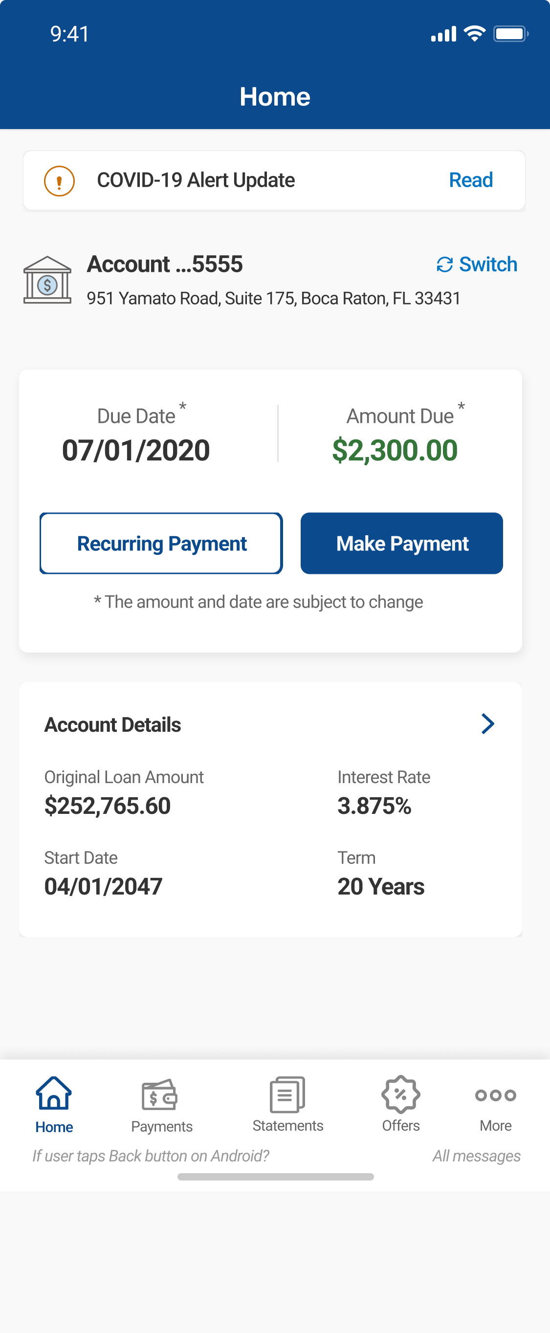
There was already an app. It took a payment. That was close to the whole of it, and anything a customer needed beyond that meant picking up the phone. The servicing line absorbed the difference.
Nothing in the product invited a second visit. There was no learning center, no financial context, no sense of where anyone stood. Engagement was low across the board, and the customers on autopay were the clearest case of all. They had automated the single thing the app existed to do, so they stopped opening it entirely.
Underneath, it was old. The architecture, the flows, the layout, and the visual language all dated from an earlier version of the company, and none of it had been built to hold more than one task.
A payments app cannot be fixed by improving payments.
02Research and strategy
Usability testing
Every flow in the product was tested, not a representative sample of them.
UX Canvas sessions, run per flow
Each flow got its own working session with the people attached to it: product managers and owners, engineering, marketing, and design. Each session covered business alignment and intended outcome, user pain points and the solutions on the table, prioritization, and the effort, resources, and cost attached to each option. Running these per flow rather than once for the product meant every decision arrived with the people who would build and own it already in the room, which is the only reason a scope this wide could move at this speed.
Competitive analysis and mapping
Competitive review of how other servicers handled the same surfaces, alongside journey and user mapping across the flows.
03The turning point
A product with a single job disappears the moment that job is automated.
Low engagement was the number we started with. It took most of the discovery work to understand that it was not a symptom of a badly built app. It was the correct response to what we had shipped.
Customers called for everything the product did not do, which was nearly everything a servicing product could do. The phone line was the real interface. The app was a payment terminal attached to the side of it, and every call was a customer routing around a screen that could not help them.
There was also nothing to come back to. No education, no context, no sense of where anyone stood on the largest financial commitment of their life. The product answered one question, what is due, and then went quiet for a month.
The autopay customers settled it. They were the people who had adopted the app most completely, and they were the ones who had stopped opening it, because automating the payment removed the only reason to launch. That is what turned the brief. The work was no longer to make payments better. It was to make the app worth opening on a day when nothing was due.
04What made it hard
This was not one product. Payments, loans, the dashboard, accounts, the message center, offers, and the learning center each carried their own logic, their own stakeholders, and their own constraints, tied into a single app. Each needed its own research, its own sessions, and its own decisions, and all of them had to ship together, iOS first and Android behind it, inside six months.
05Design decisions
The loan header as a persistent anchor.
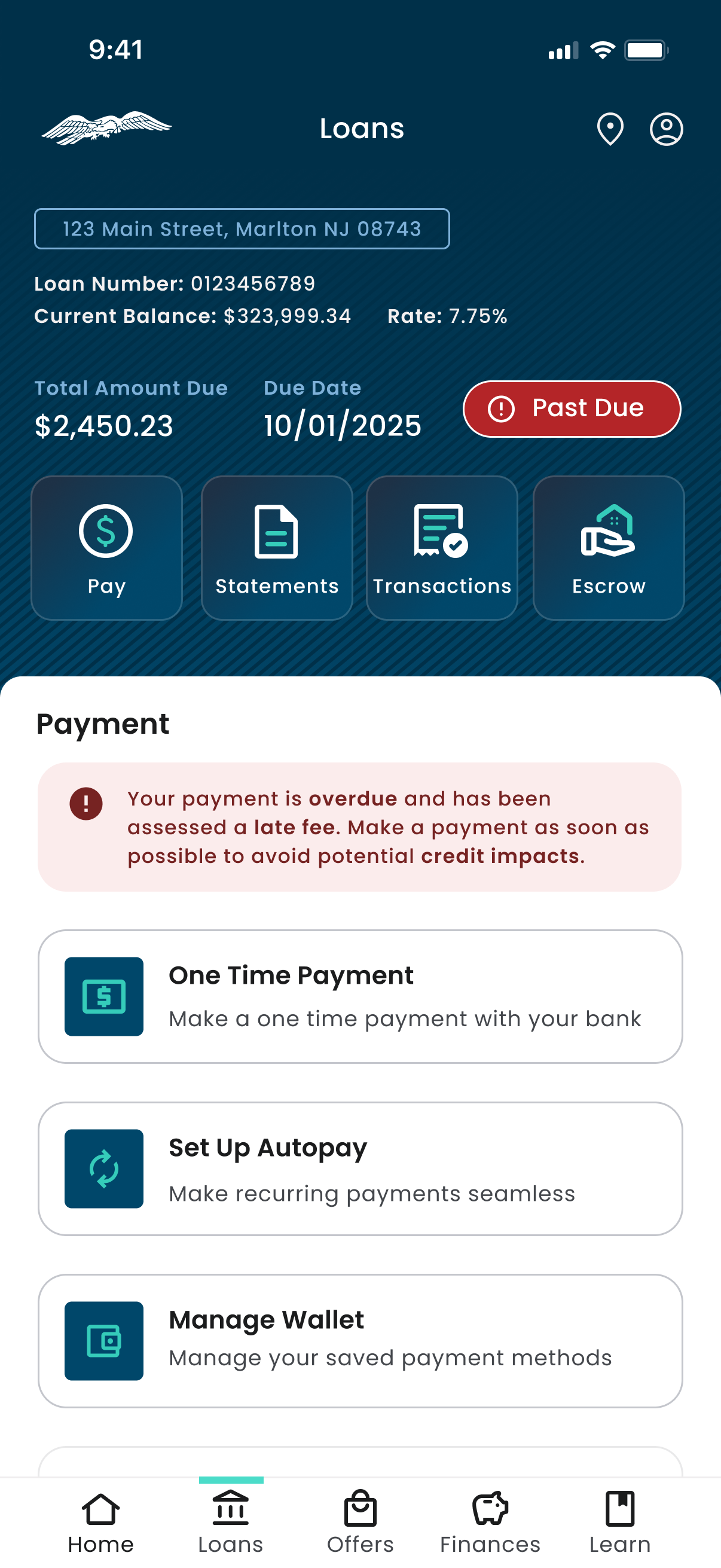
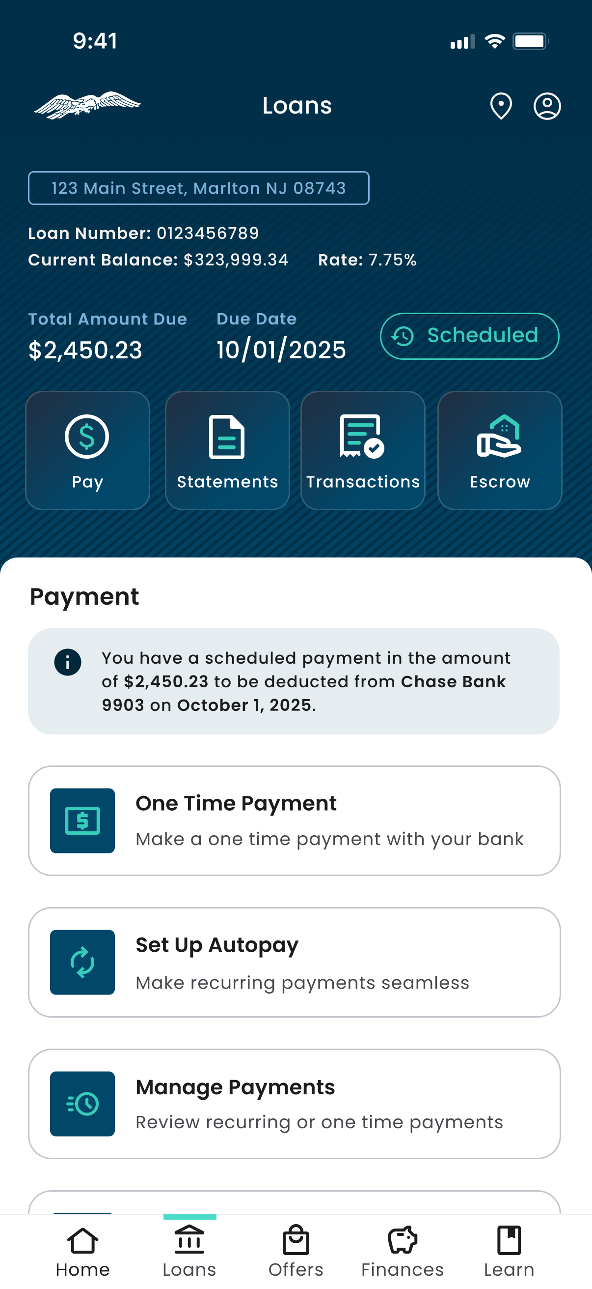
Address, loan number, balance, rate, amount due, due date, and payment status carried at the top of every Loans screen, with Pay, Statements, Transactions, and Escrow directly beneath. A customer never has to navigate back to find out where they stand.
Payment status as a state, not a message.
The same surface renders Scheduled, Autopay On, and Past Due. The alert changes color, tone, and urgency while the layout holds, so the screen is recognizable in every condition.
Consequence shown at the moment of choice.
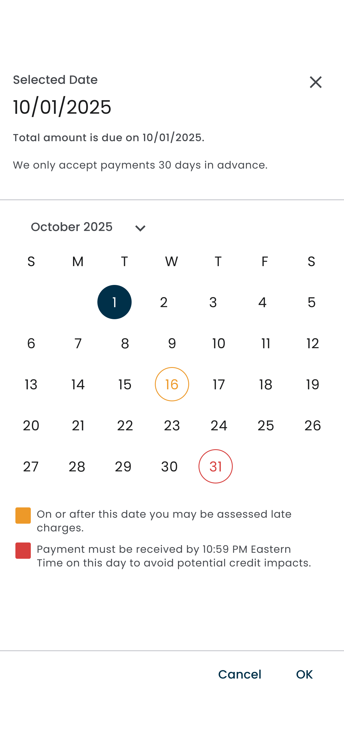
The date picker marks the due date, the late charge threshold, and the credit impact deadline on the calendar itself with a color legend, rather than describing them in fine print somewhere else. The customer picks a date already knowing what it costs.
Reversal made explicit.
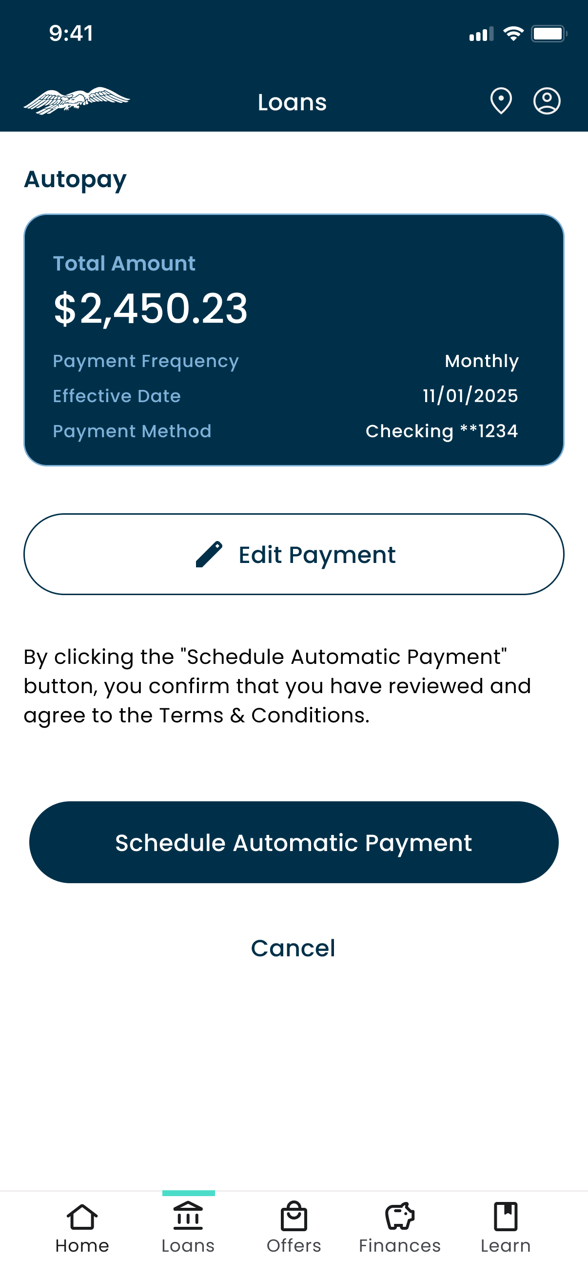
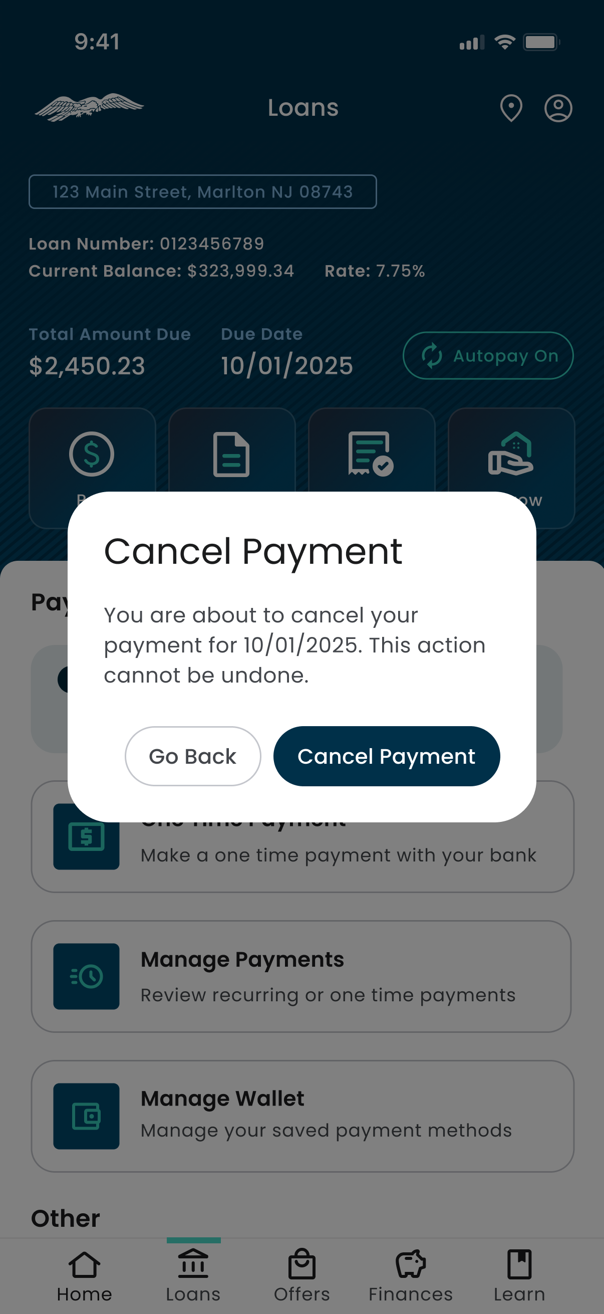
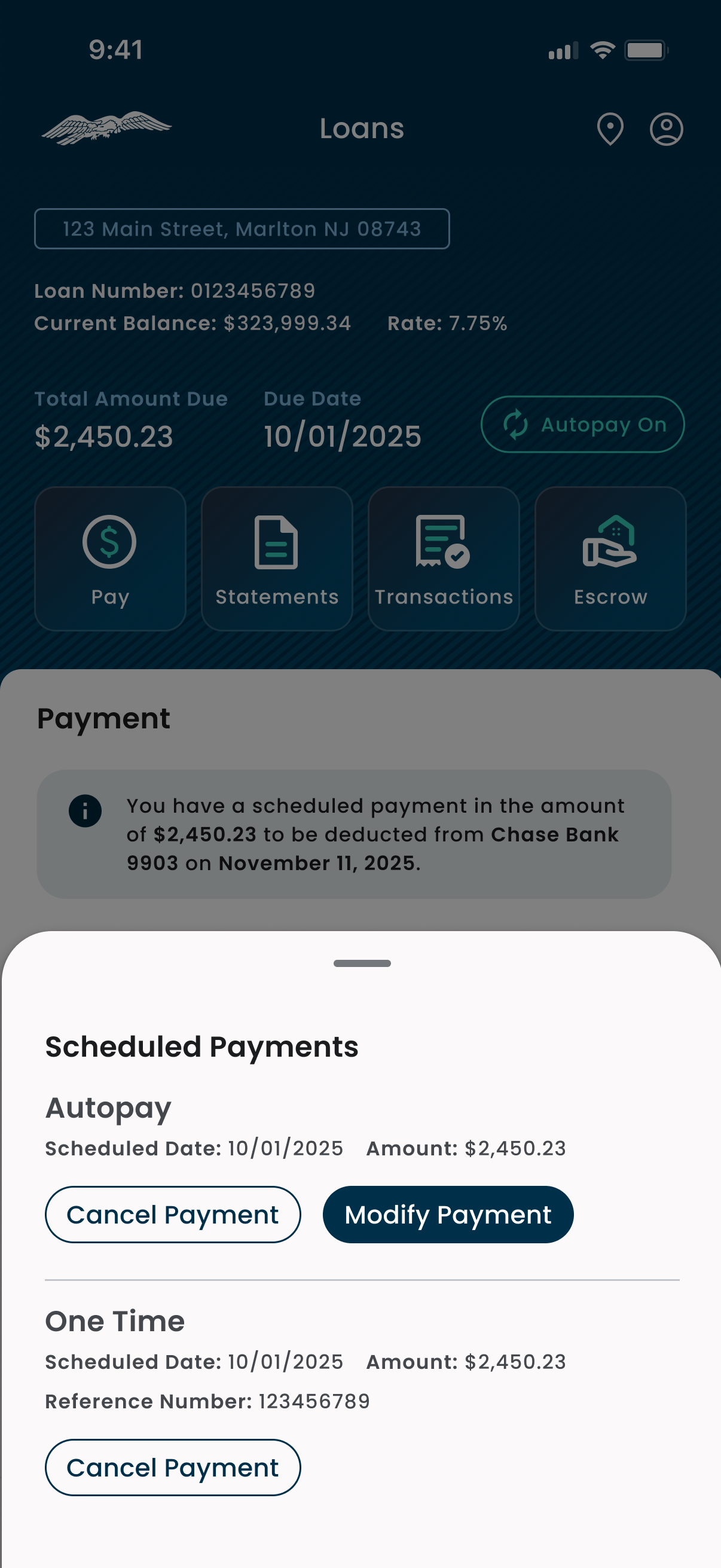
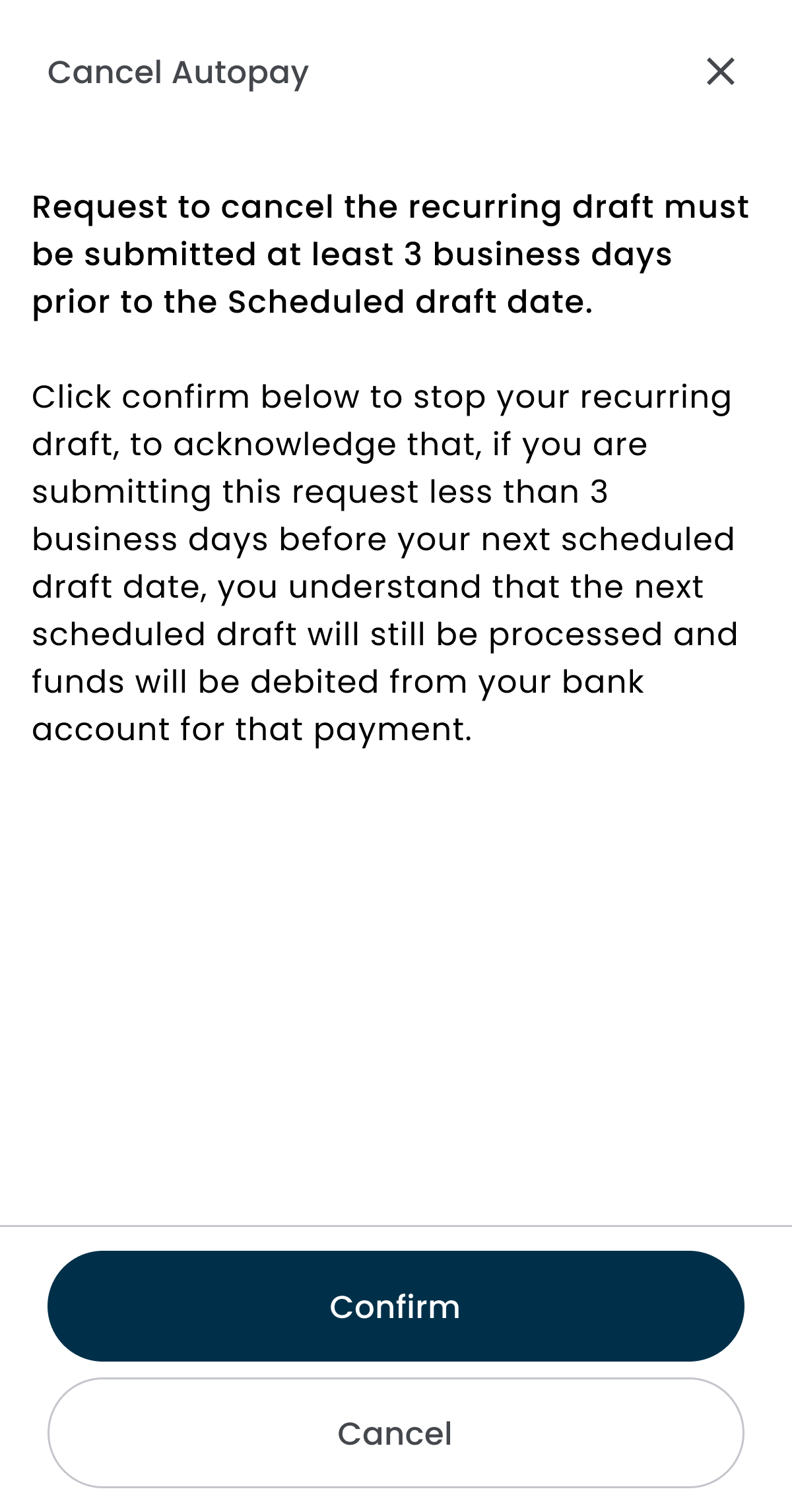
Cancel and modify are separated rather than collapsed into one control. Cancellation is confirmed in a dialog that states the action cannot be undone, and the autopay cancellation sheet spells out that a draft inside three business days will still process.
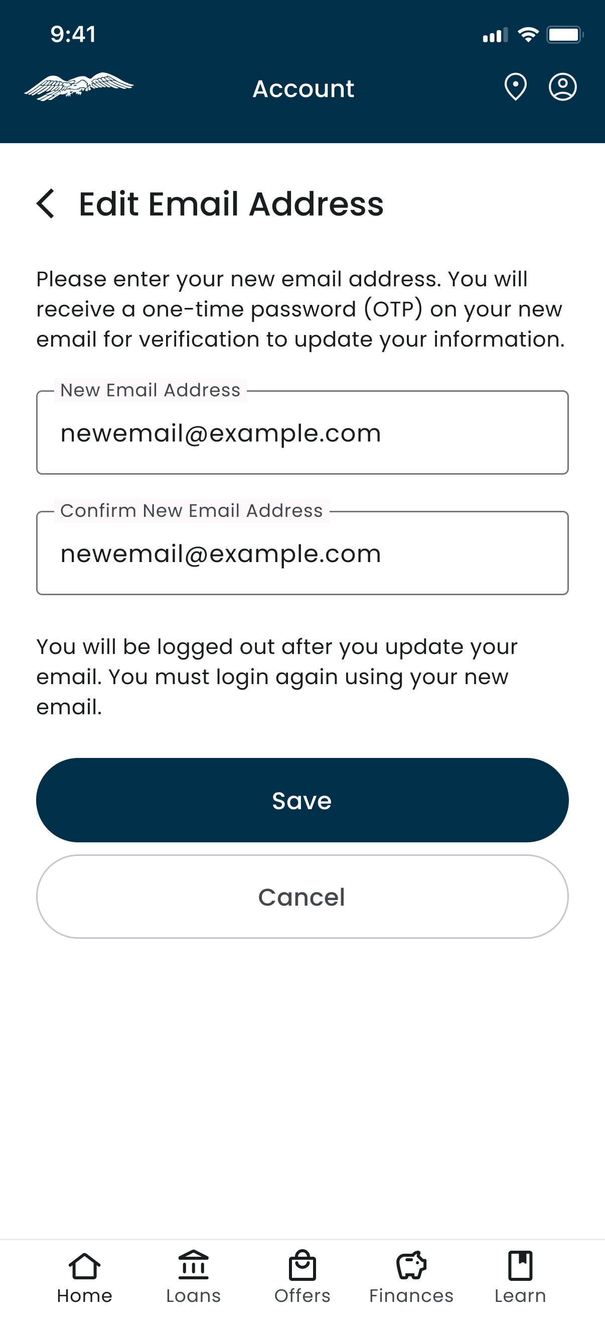
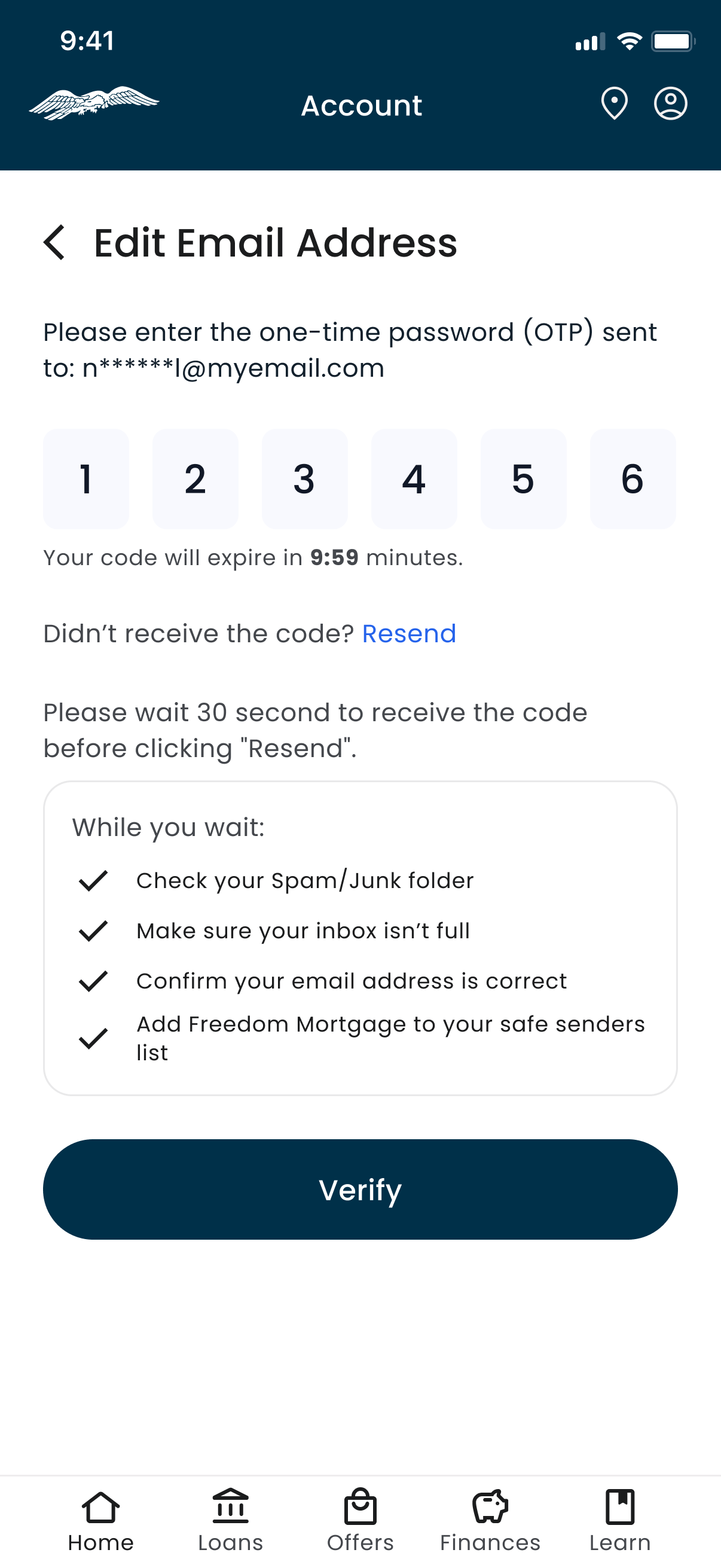
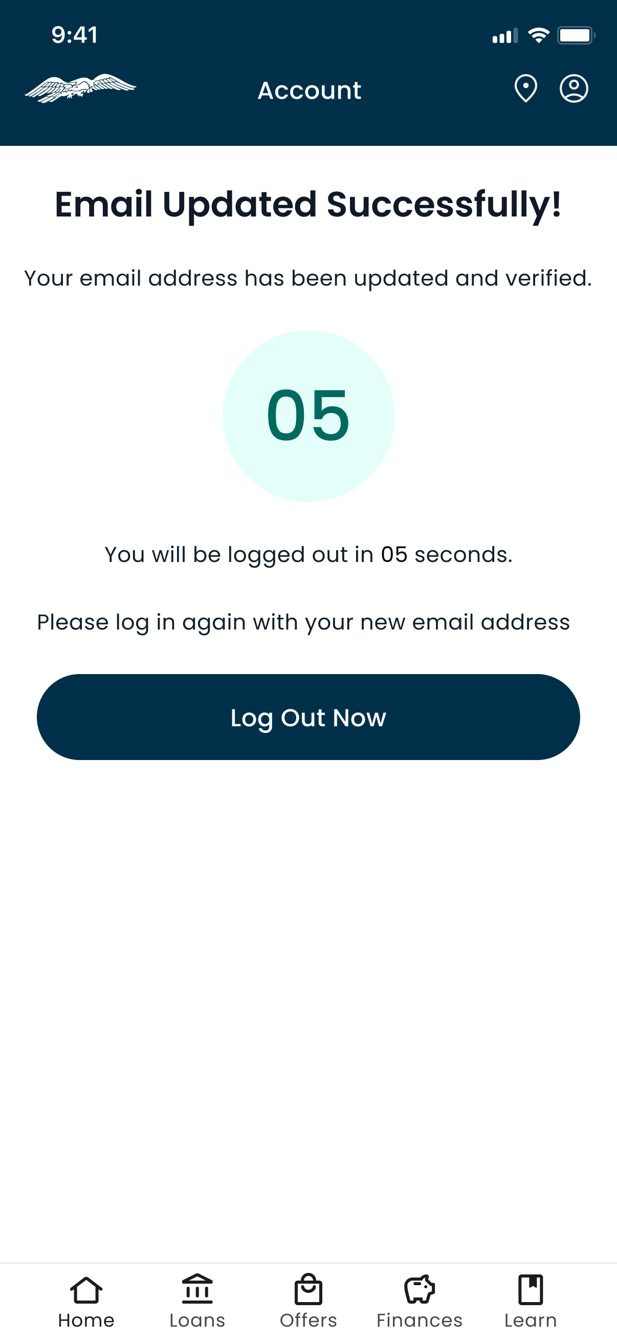
Account changes treated as security events.
Editing an email runs through a one time password, a wait state with troubleshooting guidance, and a forced logout with a visible countdown, so a customer always knows what just happened to their account and why they are being signed out.
Financial position on the home screen.
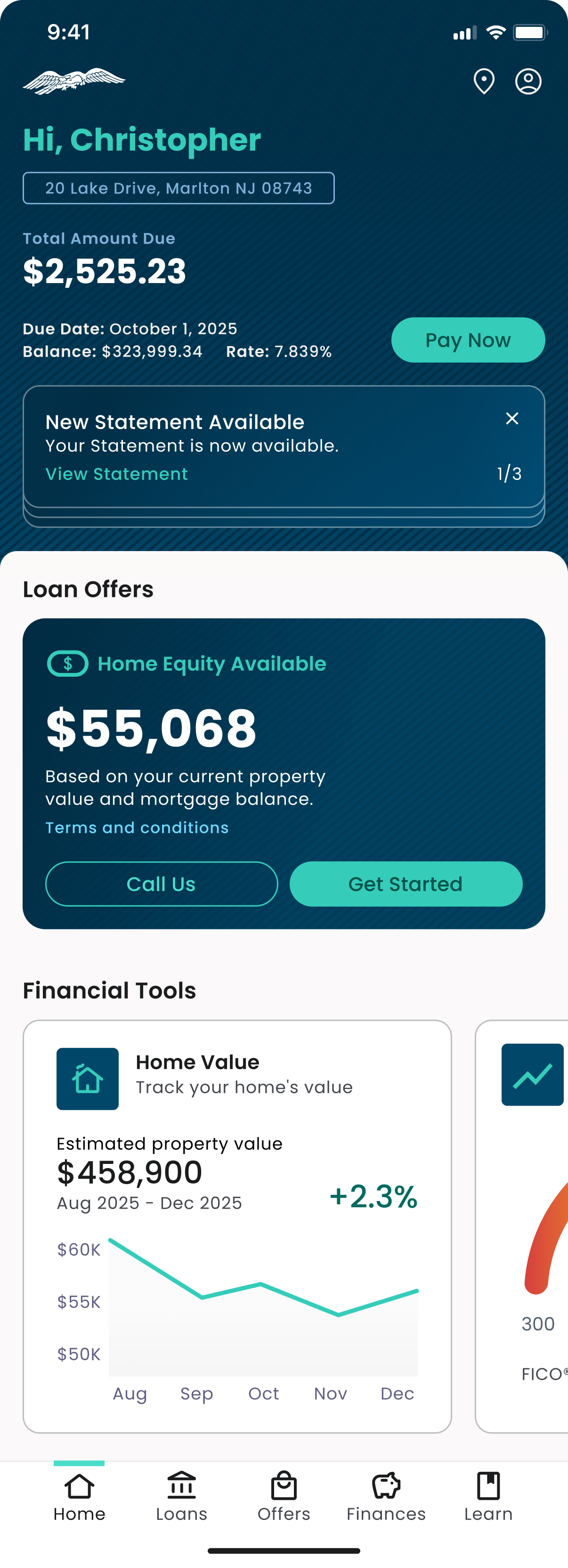
Home equity available, estimated property value with trend, and credit position sit directly beneath the payment summary. This is the section that answers the engagement problem: it is the reason to open the app on a day when nothing is due.
06Outcomes
Shipped March 2026 to 3.5 million customers, iOS first, Android second.
07What I took from it
Eight product areas meant eight sets of owners. Every flow belonged to a different product manager in a different part of the business, and all of it moved at once. A large part of this job turned out to be collaboration: getting people aligned who did not otherwise sit in the same room, then carrying those decisions up to the executive team and defending them there.
It was also the first product I owned end to end at this scale. I had two junior designers with me, but the lead was mine, and in an organization this size that is not a small thing to be handed.
What stayed with me is what the product is actually for. A mortgage is not a purchase, it is the largest thing most people owe, and when money is involved trust is the first requirement rather than a pleasant outcome. This app is not only payments, offers, and a learning center. It is also where someone goes when a hurricane has hit their house, or when they cannot make the payment this month. Working in fintech taught me the compliance and the legal constraints. The customers taught me the rest.
Trust is not something you add at the end. It is either in the screen or it is not.